Landing page design: what it must do, and the order of sections.
By Max Zeshut, Tech Lead · Updated 2026-11-17
The short answer
A landing page is one focused page for a single offer and a single action: sign up, buy, download or book. Its first screen says what the offer is and shows the action; the sections below show the product, explain how it works, answer objections and ask again. Anything that serves another goal is cut.
What a landing page must do.
- Say what it is in one look. Who it is for and what they get, in their words. A competitor should not be able to publish the headline unchanged.
- Ask for one thing. One primary action, visible without scrolling at desktop and phone sizes, and the same action again at the end. Secondary choices are quieter.
- Show the real product. The interface, the object, the work or the result, not a stock picture or a box drawn to look like an app.
- Earn belief. Proof that can be checked: named customers, real numbers, a dated changelog. Invented quotes and unsourced figures cost more than they win.
- Answer the doubts. Price, effort, risk: say them near the action (“No card needed”) and in a short FAQ.
- Load fast. The page is often the first thing someone sees after an ad or a link; a slow first screen loses them before any of the above.
The order of sections.
The order follows the questions a visitor asks, one at a time: what is it, show me, how does it work, what do I get, why should I believe you, what about my doubts, how do I start. This is how the three landing pages in the library are built, read from their full-page captures on 10 November 2026:
| Question | Orior AI | mckp.live | Making Software |
|---|---|---|---|
| 1. Say what it is | “The new era of influencing.” over one line naming the product: a consistent AI character for photos and videos | “A Film Set for Your Product” and one line on how it works | “A reference manual for people who design and build software.” |
| 2. Show the product | One large portrait, then the same character built step by step | A device mockup lit in a scene | The book's own diagrams and explanations |
| 3. How it works | The character being matched and locked, with labels on the picture | Three steps: pick a preset, make it yours, export | Why the book exists and who it is for |
| 4. What you get | Two ways to create (a prompt, a reference scene), then video | Two modes, each with its real interface and a grid of presets or scenes | The table of contents: 8 chapters, with word counts |
| 5. Proof | A row of customer logos | Counts (11 mockups, 69 presets, 389 scenes) and a dated changelog | Progress figures: chapters finished, words, images |
| 6. Objections | None on the page | A FAQ of 8 questions | “Common Questions” |
| 7. Ask again | “Create anywhere. Post everywhere.” and an App Store button | “First video in a few minutes”, Open App, “No card needed.” | Early access: “Get early access ($99)”, with a mailing list as the quiet second choice |
The order is a default, not a template. Making Software puts its early-access offer straight after the introduction and again after the questions; Orior AI has no FAQ at all. Cut the sections your audience does not need, and add one wherever they hesitate.
What the measured landing pages have in common.
- Each says what it is in one line in the first screen, and shows the product itself before explaining it.
- Each has one action and asks for it at least twice. Orior AI keeps “Start creating” in the nav and closes on an App Store button; mckp.live puts “Open Studio” under the headline and “Open App” at the end; Making Software asks twice for early access.
- The closing ask says what happens next or what it costs: “No card needed.” on mckp.live, the price in Making Software's button label.
- Proof is specific: logos, counts and progress figures. None of the three uses testimonial quotes.
- None shows a pricing table on the page. Two link to pricing from the nav; Making Software puts the price on the button.
- Two keep a short nav with the action at the right; Making Software has no nav at all.
- They run from 7,122 to 11,577 px at 1440 px wide, about 8 to 13 screens.
Two places where they differ from our own rules. Making Software shows no button in its first screen at either size: the book's diagrams carry the page, and the first action is about two and a half screens down. And on a phone, Orior AI's first screen is an app-install prompt with “Continue on web” under it, so the page itself starts one tap later.
Measured sections you can build from.
- Orior AI hero: a one-line 60 px headline at weight 600, one muted line, then a 1080 × 608 cut-out portrait with a single glass status chip.
- mckp.live FAQ: native details rows on a dark ground, hairlines and a plus that turns, so it works with a keyboard and without a script.
- Making Software contents: what you get, set as a book's table of contents in three columns.
For the first screen, read the hero section entry; for the rest, browse every measured section by type. Sites: Orior AI, mckp.live, Making Software.
Build the skeleton.
One main, one action repeated, sections in the order of the questions. The hero image is the LCP element, so it loads first:
<header>
  <a href="/" aria-label="Home">…</a>
  <nav aria-label="Main">…</nav>          <!-- short: 3 to 5 links -->
  <a class="cta" href="/start">Start creating</a>
</header>
<main>
  <section aria-labelledby="offer">          <!-- 1. what it is, and the action -->
    <h1 id="offer">Name the offer in your audience's words</h1>
    <p>One line: who it is for and what they get.</p>
    <a class="cta" href="/start">Start creating</a>
    <p class="next">No card needed.</p>
    <img src="/product.webp" width="1080" height="608"
         alt="…" fetchpriority="high">        <!-- the LCP image: never lazy -->
  </section>
  <section>…</section>  <!-- 2–3. the product, and how it works -->
  <section>…</section>  <!-- 4. what you get -->
  <section>…</section>  <!-- 5. proof you can check -->
  <section>…</section>  <!-- 6. questions people ask before buying -->
  <section>…</section>  <!-- 7. the same action again -->
</main>
<footer>…</footer>
body {
background: #f7f6f3;
color: #111111; /* 17.47 : 1 */
}
.cta {
display: inline-flex;
align-items: center;
min-block-size: 44px; /* WCAG 2.2 asks for 24 px at least */
padding-inline: 20px;
border-radius: 999px;
background: #111111;
color: #ffffff; /* 18.88 : 1 */
font-weight: 500;
text-decoration: none;
}
.cta:focus-visible {
outline: 2px solid #111111; /* on #f7f6f3: 17.47 : 1 */
outline-offset: 3px;
}
.next {
color: #5f5f5f; /* on #f7f6f3: 5.91 : 1 */
}The off-white ground is the one Orior AI uses. Its own secondary grey, #737373, is 4.39:1 on it and fails; #5f5f5f passes at 5.91:1. The ratios in the comments were computed with the WCAG 2 formula.
Checks before you ship.
- A five-second test: people shown the first screen can say what the page offers and for whom.
- The primary action is fully visible without scrolling at 1440 × 900 and 390 × 844.
- The action's label starts with a verb and names the outcome; a short line beside it says what happens next or what it costs.
- Every number, logo and quote has a source you could show; anything else is removed.
- Text keeps 4.5:1 contrast (3:1 for large text), including over photos and video.
- Largest Contentful Paint is 2.5 seconds or less at the 75th percentile, on phones and desktops separately.
- The section order answers your audience's questions, not a stock sequence of hero, logos, three cards, testimonials, pricing, FAQ.
Each check is a rule in the website design checklist, with how to test it and its sources.
Real examples in the library.
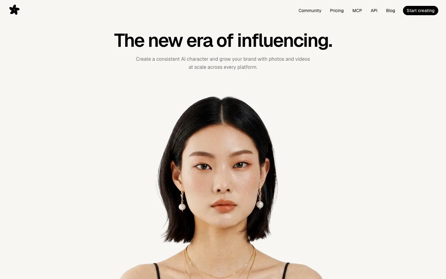
Orior AI
Landing page for an AI tool that keeps one character's face consistent across photos and videos, then posts them to social platforms. A pale hero of large portrait photography with face-match callouts turns into a black section of before/after image pairs and a logo strip.
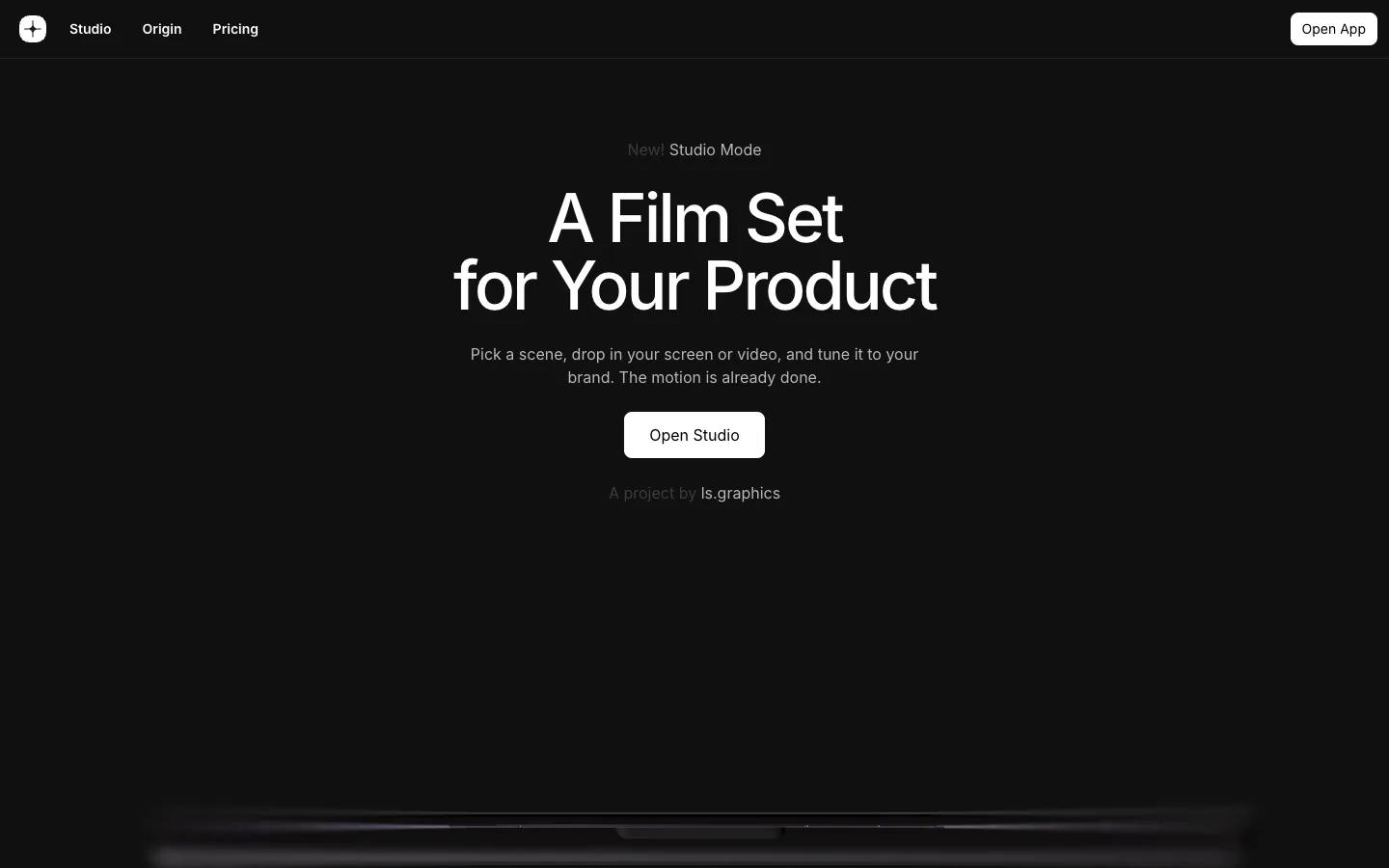
mckp.live
A dark, near-black product page for an animated mockup tool: centered Inter headline, a glowing device scene rising from the bottom of the first screen, and big product videos and preset grids with very little other colour.
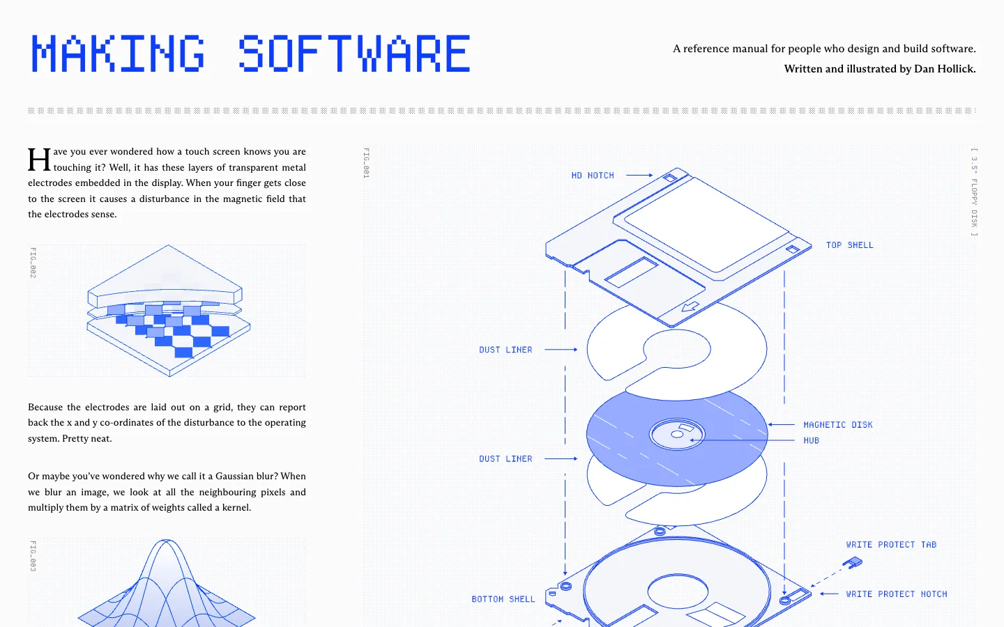
Making Software
A reference book about how software works, set like a technical manual: a pixel-font masthead in electric blue, serif body text in columns, and blue line-drawn isometric diagrams with FIG_ captions on a faint dot grid.
Questions.
What is a landing page?
A landing page is one focused page for a single offer and a single action: sign up, buy, download or book. Its first screen says what the offer is and shows the action; the sections below show the product, explain how it works, answer objections and ask again. Anything that serves another goal is cut.
What is the difference between a landing page and a homepage?
A homepage serves everyone who arrives and points them to many places. A landing page serves one audience and one offer, and every section moves toward one action. A product's homepage can work as a landing page when the product does one thing.
What sections should a landing page have?
Answer the visitor's questions in the order they ask them: what is it, show me, how does it work, what do I get, why should I believe you, what about my doubts, and how do I start. Drop any section your audience does not need, and add one for any objection they raise.
How long should a landing page be?
As long as the questions need. The three landing pages measured here run from 7,122 to 11,577 px at 1440 px wide, about 8 to 13 screens. Length is fine when the action is in the first screen and asked again at the end.
Should a landing page have navigation?
A short one is fine if the primary action is in it. Two of the three measured pages keep a nav of three to five links with the action on the right; the third has none. Avoid a full site menu that sends people away.
Where should the call to action go?
In the first screen at desktop and phone sizes, and again at the end. In a 2018 NN/g eye-tracking study, 57% of viewing time was above the fold and 74% within the first two screens.
How fast should a landing page load?
The largest element, usually the hero image or headline, should appear within 2.5 seconds for 75% of visits, on phones and desktops measured separately. Do not lazy-load the hero image, and give it fetchpriority="high".
Sources
- Nielsen Norman Group, “Scrolling and attention”, Fessenden, 15 April 2018 (120 participants)
- Nielsen Norman Group, “Homepage design principles”, 15 March 2024
- web.dev, “Web Vitals”
- web.dev, “Largest Contentful Paint (LCP)”
- W3C, WCAG 2.2 quick reference
- What a design! full-page captures of oriorai.com, mckp.live and makingsoftware.com at 1440 × 900 and 390 × 844, 10 November 2026
- What a design! section measurements of the Orior AI hero and the mckp.live FAQ on their live sites, 16 November 2026
- What a design! Quality Bar: first screen, primary action, headline, proof, section order, contrast and LCP