Font pairing: the rules that hold, and pairs from real sites.
By Max Zeshut, Tech Lead · Updated 2026-11-17
The short answer
Font pairing is choosing typefaces that work together on one page, usually a display face for headlines and a text face for reading. Give each face one job, keep their x-heights and widths close, and let them differ in one clear way. One family with weights is the safe default: 12 of 21 sites in our library use it.
What pairing is for.
A page has at least two kinds of reading: glancing at headlines and reading running text. A display face is drawn to look good large and set tight; a text face is drawn to stay clear at 16 to 20 px for paragraph after paragraph. Pairing means choosing those two so they look like one voice with two registers, not two voices arguing. Often the best pair is one family: a bold weight or a display cut for headlines and the regular weight for text.
The rules that hold.
- Contrast of role, not of everything. Give each face one job (headlines, text, labels) and keep it there. In running text, change faces only between paragraphs or elements, never inside a sentence; a single word in a second face inside a headline is a display device, used sparingly (Cluely and Delta Cafés do it). Two faces that differ in class, weight, width and mood at once look like an accident.
- Match the x-height. The height of the lowercase decides how big a face looks. If the text face has a much smaller x-height than the headline face, the page looks mismatched even at correct sizes. Compare them at the same size, or set
font-size-adjust. - Match the width. A narrow headline face over a wide text face changes the rhythm from line to line. Similar widths give an even texture; a deliberately condensed headline face works when the text face stays plain, as on Delta Cafés.
- One family with weights is the safe default. Size and weight inside one family give all the hierarchy most pages need, with fewer files to load. Add a second face only when it does something the first cannot.
- Keep the count low. Two families at most, plus a monospace for code or labels if the page needs one.
- Keep thin weights large. Weights of 300 or lighter belong at 24 px and above; under that, use 400 or heavier.
Pairs measured on real sites.
We read the fonts each site actually renders, from computed styles, when it was captured (6 to 17 November 2026). The display face is what sets headlines and any text from 30 px up; the text face sets the running text. These nine of the 21 published sites use two faces.
| Site | Display face | Text face | Kind of pair |
|---|---|---|---|
| Daniel Sun | LT Superior Serif, 400 | Inter Display, 400 | Serif and sans, same weight |
| Delta Cafés | Trade Gothic, 700, condensed capitals | Delta Season, 550 (also 300 for light display words) | Bold condensed sans and a light serif |
| Atlas by WorkOS | InterDisplay, 600 | Lato, 400 | Two sans faces |
| Shotbase | TWK Everett, 500 | Google Sans, 400 | Two sans faces |
| Pebble Flow | Youth, 500 | Aeonik, 500 | Two sans faces, same weight |
| United Carriers | BT Steinhart, 700 | Helvetica Neue, 500 | Two sans faces, plus BT Steinhart Mono for labels |
| Aside | A display face served as “displayFont”, 450 | Geist, 400 | Display face and a neutral sans |
| Cluely | Geist, 500, with EB Garamond 500 for a few words | Geist, 400 | One family and a serif accent (12.9% of the type) |
| Maxima Therapy | ABC Diatype Rounded, 900, with Robuck Rounded 400 | ABC Diatype Rounded Plus, 500 | One family and a second display face (20.2%) |
The other twelve set headlines and text in one family:
| Site | Family | Display / text weight | Monospace |
|---|---|---|---|
| Orior AI | Geist | 600 / 400 | None |
| Heart Aerospace | nhgDisplay and nhgText (display and text cuts, by their names) | 700 / 400 | None |
| Bécane | Eurostile Becane | 700 / 400 | None |
| Butter | DieGrotesk | 400 / 400 | None |
| fallengrey | Neue | 400 / 400 | None |
| Serve Robotics | Roobert | 400 / 400 | None |
| mckp.live | Inter | 400 / 400 | DM Mono |
| Making Software | Arizona (serif) | 400 / 400 | Departure Mono, 10.8% of the type |
| Stripe | Söhne (served as sohne-var) | 300 / 300 | Source Code Pro |
The remaining three are Frutiger Aero references (Micro Chronicles, Frutiger Aero Archive and Skeuoss), all in Segoe UI, the Windows system face of the era.
What the pairs show.
- One family is the most common choice: 12 of 21 sites, and 7 of the 13 in the collection.
- Size carries the hierarchy more than weight does. Nine of the 21 set headlines and text in the same weight; the widest gap is Maxima Therapy's 900 over 500.
- A second face is usually small or has a narrow job. Cluely's EB Garamond is 12.9% of its type, weighted by size; Maxima Therapy's Robuck Rounded is 20.2%. Monospace faces appear on 7 sites, from 0.2% of the type to 25.9% on Skeuoss.
- Serif and sans is not the only pair: four of the seven two-face pairs are two sans faces.
- The serif and sans pairs that work keep something shared: Daniel Sun sets both faces at weight 400.
- No site uses more than three named families, and Maxima Therapy's three include two cuts of Diatype Rounded.
The library does not record x-heights or widths yet, so those two rules come from the sources below, not from this census.
A fluid type scale in CSS.
One scale for both faces: text sizes in rem, headings in clamp() with rem bounds and a small vw term. Swap in your two faces:
/* Text steps in rem: they double at 200% zoom. */
:root {
  --step--1: 0.875rem;  /* 14 px, captions only */
  --step-0: 1.0625rem;  /* 17 px, body */
  --step-1: 1.25rem;    /* 20 px */
  /* Headings: rem plus a small vw term, never vw alone. The vw part stays
     no larger than the rem part, so each still grows 1.5x or more at 200% zoom. */
  --step-2: clamp(1.5rem, 1.25rem + 0.75vw, 2rem);  /* 24 to 32 px */
  --step-3: clamp(2rem, 1.5rem + 1.5vw, 3rem);      /* 32 to 48 px */
  --step-4: clamp(2.5rem, 2rem + 2vw, 4.5rem);      /* 40 to 72 px */

  --font-display: "Your Display", Georgia, serif;
  --font-text: "Your Text", system-ui, sans-serif;
}

body {
  font: 400 var(--step-0) / 1.5 var(--font-text);
  color: #1a1a1a;                 /* on #fafafa: 16.67 : 1 */
  background: #fafafa;
}
p { max-inline-size: 66ch; }
small, figcaption {
  font-size: var(--step--1);
  color: #595959;                 /* on #fafafa: 6.71 : 1 */
}

h1, h2, h3 {
  font-family: var(--font-display);
  line-height: 1.1;
  text-wrap: balance;
}
h1 { font-size: var(--step-4); letter-spacing: -0.02em; }
h2 { font-size: var(--step-3); }
h3 { font-size: var(--step-2); }

/* A word in a second face inside a headline: match x-heights.
   0.5 is an example; use your display face's x-height divided by its size.
   font-size-adjust is inherited, so the <em> follows the h1. */
h1 { font-size-adjust: ex-height 0.5; }
h1 em { font-family: "Your Accent", serif; font-style: italic; }
We measured this scale in Chrome on 17 November 2026. At 1440 px the three heading steps are 30.8, 45.6 and 60.8 px; at 200% zoom they become 50.8, 69.6 and 92.8 px, 1.53 to 1.65 times larger, and at 500% the largest reaches 3.5 times. At 320 px they are 24, 32 and 40 px. A clamp() with a large vw term does not do this: clamp(2.5rem, 1rem + 8vw, 9rem) grew only 1.14 times at 200% zoom in our 5 November test. The colours in the comments were computed with the WCAG 2 formula.
How to choose a pair.
- Pick the text face first: it carries most of the words. Test it at 16 to 18 px on a phone.
- Try the same family's bold or display cut for headlines. Stop here if the page has a voice.
- If it needs more, choose a headline face that differs in one way (class, width or weight) and matches the x-height.
- Set both on a real headline and a real paragraph from your page, never on a pangram.
- Check the headline with the hero section rules: 96 px at most, and under 40 characters from 72 px up.
Real examples in the library.
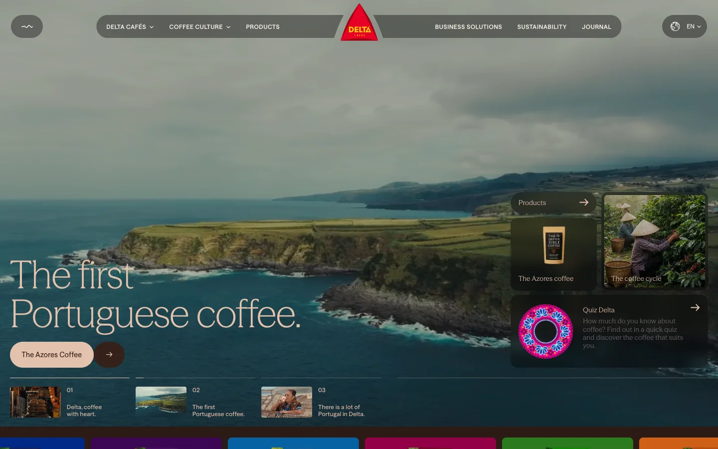
Delta Cafés
A Portuguese coffee brand's heritage site. A full-bleed Azores landscape under a light serif headline, a strip of coloured packs, a dark espresso-brown story section with archive photos orbiting a 1961 portrait, and a cream journal and quiz.
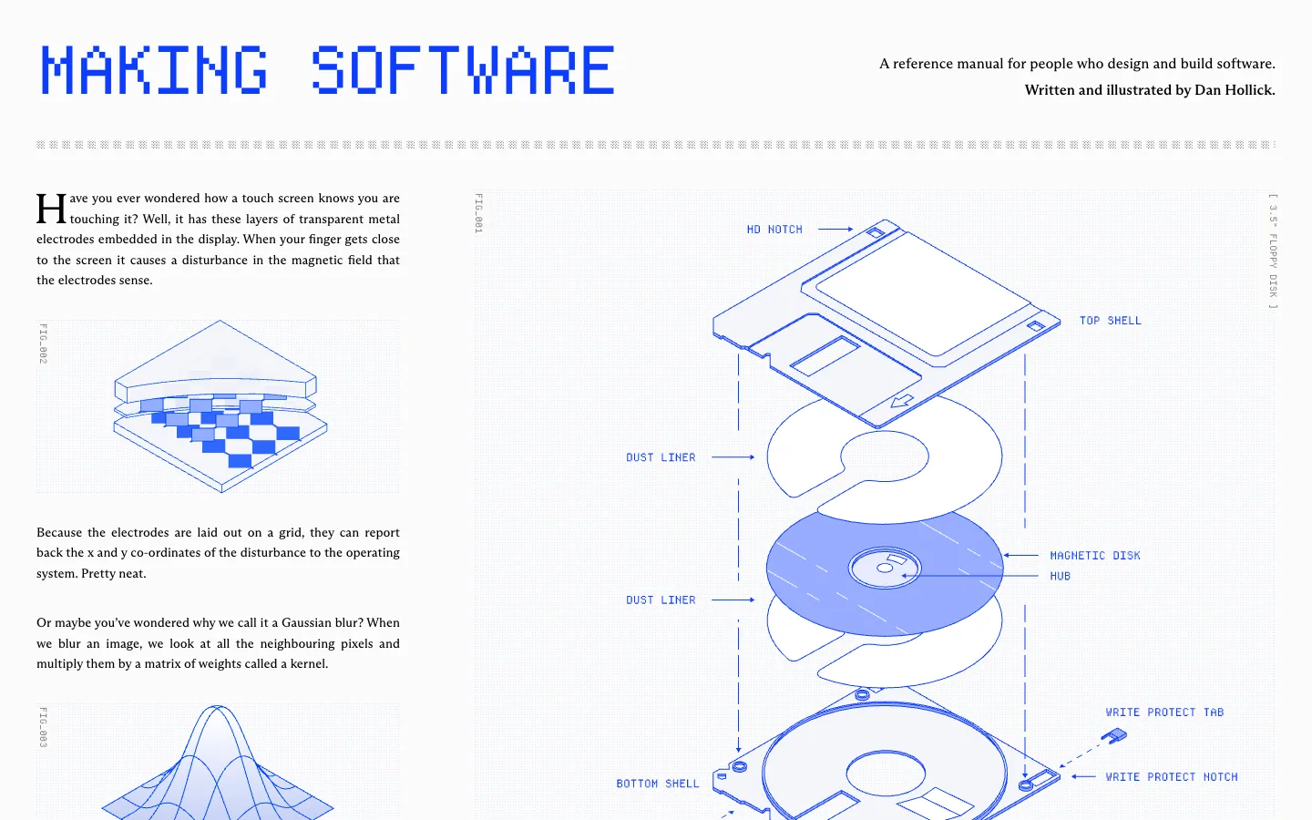
Making Software
A reference book about how software works, set like a technical manual: a pixel-font masthead in electric blue, serif body text in columns, and blue line-drawn isometric diagrams with FIG_ captions on a faint dot grid.
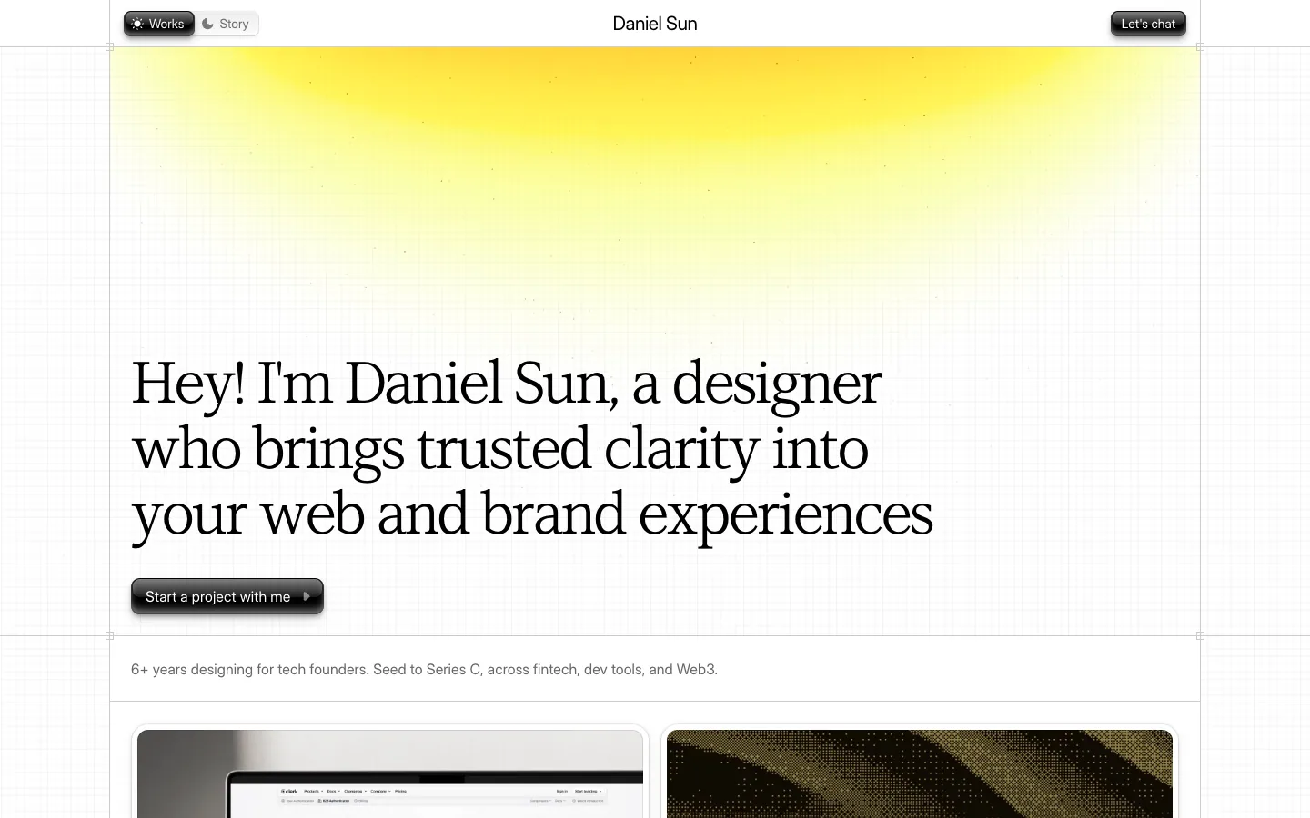
Daniel Sun
A designer's personal site on a faint blueprint grid: a soft yellow sun glow over a large serif headline, glossy embossed buttons, and a masonry of branding and web project cards with a logo wall below.

Cluely
AI meeting assistant site on a painted sky: a centred serif headline and a glossy blue download button over mountains at sunrise, with the product's frosted overlay floating on a video call below, then light pastel sections with stats, a FAQ and a closing band of soft 3D keys.
Questions.
What is font pairing?
Font pairing is choosing typefaces that work together on one page, usually a display face for headlines and a text face for reading. Give each face one job, keep their x-heights and widths close, and let them differ in one clear way. One family with weights is the safe default: 12 of 21 sites in our library use it.
How many fonts should a website use?
Two at most, plus a monospace if you show code or labels. Of the 21 published sites in our library, 12 set headlines and text in one family, and none used more than three named families. Our own Quality Bar caps it at two; Butterick puts it as most documents tolerating a second font and few a third.
Do I have to pair a serif with a sans serif?
No. It is one way to get a clear difference, not a rule. Four of the seven two-face pairs in our library are two sans faces, and Butterick notes that two serifs can be mixed if they are clearly different. What matters is that each face has its own job.
What makes two fonts go well together?
A clear difference in one or two ways (class, weight or width) and agreement in the rest: similar x-heights so lowercase looks the same size, similar widths for a calm texture, and matching mood. Faces from one superfamily share proportions by design, and faces by the same designer often do.
How do I match the x-heights of two fonts?
Compare lowercase letters at the same size and adjust one face until they align. In CSS, font-size-adjust: ex-height <number> scales a face so its x-height is that share of the font size; it is Baseline 2024, so check your audience's browsers.
Is clamp() safe for font sizes?
For headings, if the vw part is no larger than the rem part and the bounds are in rem. A clamp() with a large vw term barely grows when people zoom: we measured clamp(2.5rem, 1rem + 8vw, 9rem) growing only 1.14x at 200% zoom. Keep body text in plain rem.
Sources
- Matthew Butterick, Practical Typography, “Mixing fonts”, read 17 November 2026
- Aura Seltzer, “Type study: pairing typefaces”, Typekit blog, 23 May 2012
- MDN Web Docs, font-size-adjust (Baseline 2024), read 17 November 2026
- Adrian Roselli, “Responsive type and zoom”, 2019
- Utopia, “Clamp”, Trys Mudford
- W3C, Understanding SC 1.4.4 Resize Text
- What a design! font census of 21 published sites, read from computed styles at capture, 6 to 17 November 2026
- What a design! zoom measurements in Chrome: 5 November 2026 (vw and clamp sizes) and 17 November 2026 (the scale on this page)
- What a design! Quality Bar: font families, type scale, fluid type and zoom, thin weights, contrast