Hero section: what it is, its types, and measured examples.
By Max Zeshut, Tech Lead · Updated 2026-11-17
The short answer
A hero section is the first screen of a web page: usually a headline, one short supporting line, one main action and one strong visual. It has a few seconds to say what the site is and what to do next, so the best ones show one thing and leave space around it.
What five measured heroes have in common.
These heroes were measured on their live sites on 16 November 2026 at 1440 × 900. Each one leads with a single visual and keeps the actions to one or none.
| Site | Headline | Lead visual | Actions |
|---|---|---|---|
| Butter | 107.6 px, weight 400, one line | Chrome 3D keychain objects above the headline | 1 button |
| Heart Aerospace | 129.6 px, weight 700, two lines at the bottom left | A full-bleed photo of the aircraft | None (a Pause control for the video) |
| Daniel Sun | 64 px serif, weight 400, three lines | A warm yellow glow on a drafting grid | 1 glossy button |
| Orior AI | 60 px, weight 600, tracking −0.04em, one line | One large cut-out portrait, 1080 × 608 px | None in the hero; one pill in the nav |
| fallengrey | No headline at all | A slowly turning ring of 35 project cards | One “+ text me +” in the nav |
- Headlines ran from 60 to 130 px. Across all 11 published homepages with a measurable headline, the range is 48 to 133 px and the median is 64 px.
- Two of the five break our own 96 px rule of thumb and still work, because the headline is the only text on the screen.
- No hero stacks features, logos and a carousel into the first screen. Proof comes in the next section.
The seven types of hero.
The library describes every first screen with one of these terms. Each links to the real sites that use it.
Centered headline
Centered headline, subline and call to action with little else on the first screen.
Examples: Atlas by WorkOS, Orior AI, mckp.live, Butter
Split
First screen divided into two halves: text on one side, visual or UI on the other.
Examples: Stripe
Full-bleed image
Edge-to-edge photograph or illustration behind the headline.
Examples: Shotbase, Heart Aerospace
Type only
Headline type is the only visual on the first screen.
Examples: Daniel Sun
Product UI
A screenshot or live mockup of the product interface in the first screen.
Examples: Aside
3D / WebGL
A 3D object or WebGL scene in the first screen.
Examples: United Carriers, fallengrey
Video
Looping or autoplay video as the first-screen background or main element.
The anatomy.
- Navigation above it, short. Several measured heroes move the only action into the nav.
- Headline that names the offer or the audience; a competitor should not be able to publish it unchanged.
- Supporting line, one or two sentences, in a muted colour that still passes contrast.
- One action, labelled with a verb (“Start creating”, not “Submit”), with what happens next or what it costs nearby.
- One lead visual specific to the subject: the product, the work, the place or the object.
Checks before you ship.
- The page says who it is for and what it offers in the first screen, in the audience's words.
- The primary action is visible without scrolling, at desktop and phone sizes.
- Text over a photo or video keeps 4.5:1 contrast (3:1 for large text) against the worst part of the image beneath it.
- The lead image is at least 40% visible at desktop and phone widths, not covered or cut off.
- The largest element appears within 2.5 seconds on a phone; the hero image is not lazy-loaded.
- Motion that runs longer than 5 seconds can be paused, and stops with reduced motion.
How to build one.
Start from a measured hero rather than a blank page: each hero section in the library lists its sizes, spacing, motion and exactly what you may change. Swap in your own headline, visual and action, keep the proportions, then run the checks above. The whata.design skill does this for an AI agent, with three audited hero skeletons (split, type-led and object-led) as a fallback.
Real examples in the library.
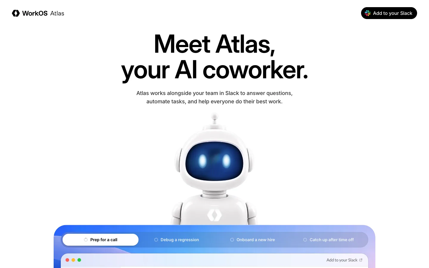
Atlas by WorkOS
A product page for an AI coworker that lives in Slack: a large centered Inter headline, a glossy 3D robot mascot, and Slack-window product scenes framed by saturated blue-to-pink gradient panels on white.
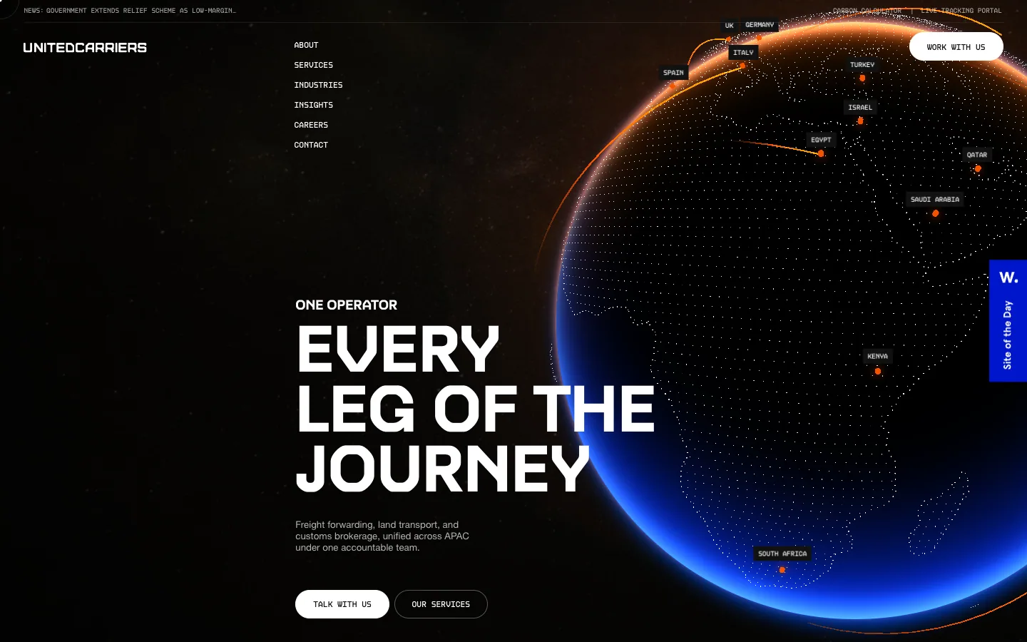
United Carriers
Freight forwarding across APAC, presented as a cinematic dark scene: a glowing WebGL globe, wide techno display caps and mono route labels, then calm white sections with big numbers.
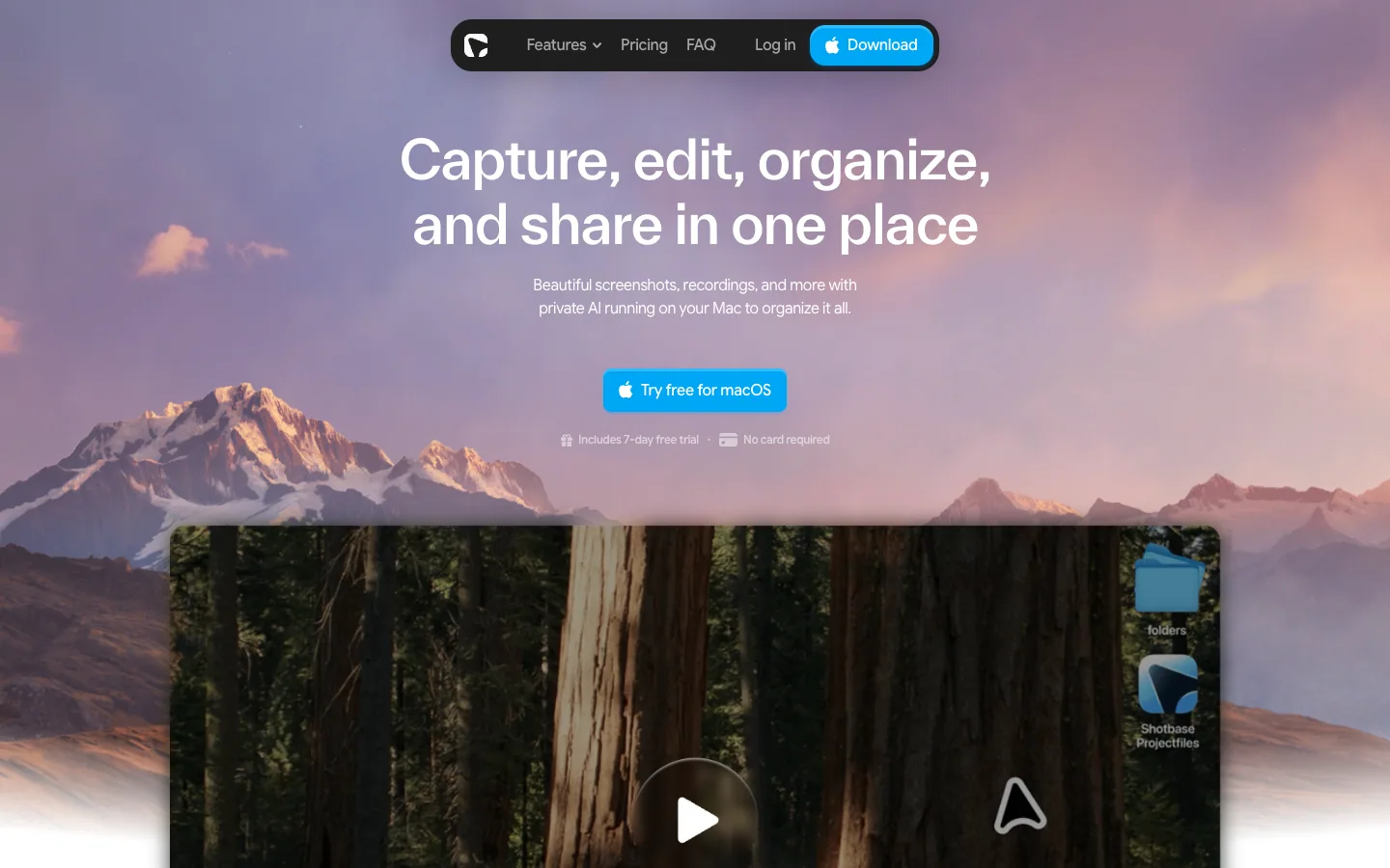
Shotbase
A Mac screen-capture app that dresses its homepage like macOS: a landscape-wallpaper hero, floating dark pill nav, and soft frosted product scenes on white.
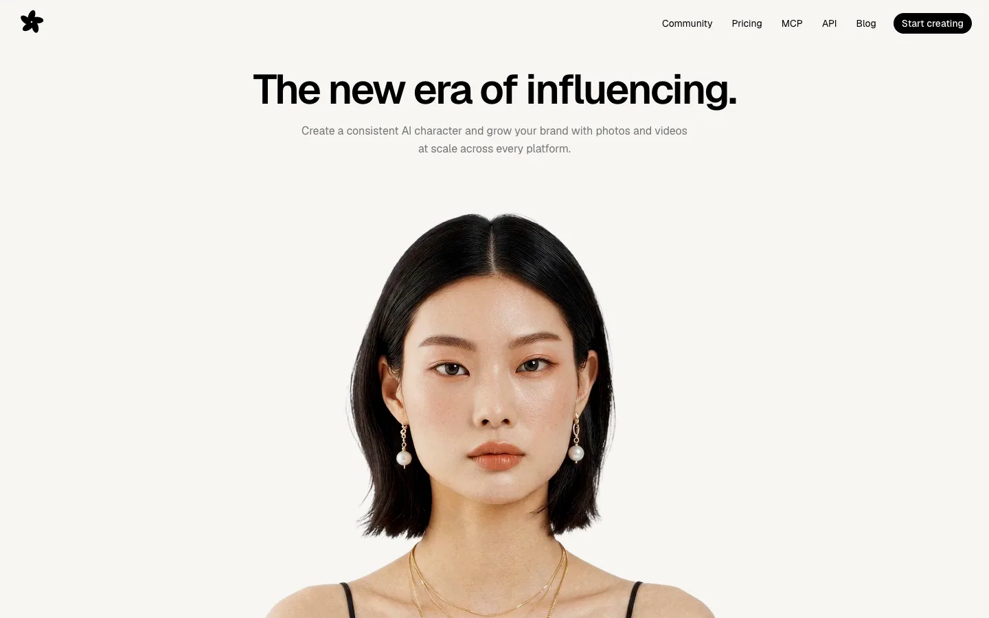
Orior AI
Landing page for an AI tool that keeps one character's face consistent across photos and videos, then posts them to social platforms. A pale hero of large portrait photography with face-match callouts turns into a black section of before/after image pairs and a logo strip.
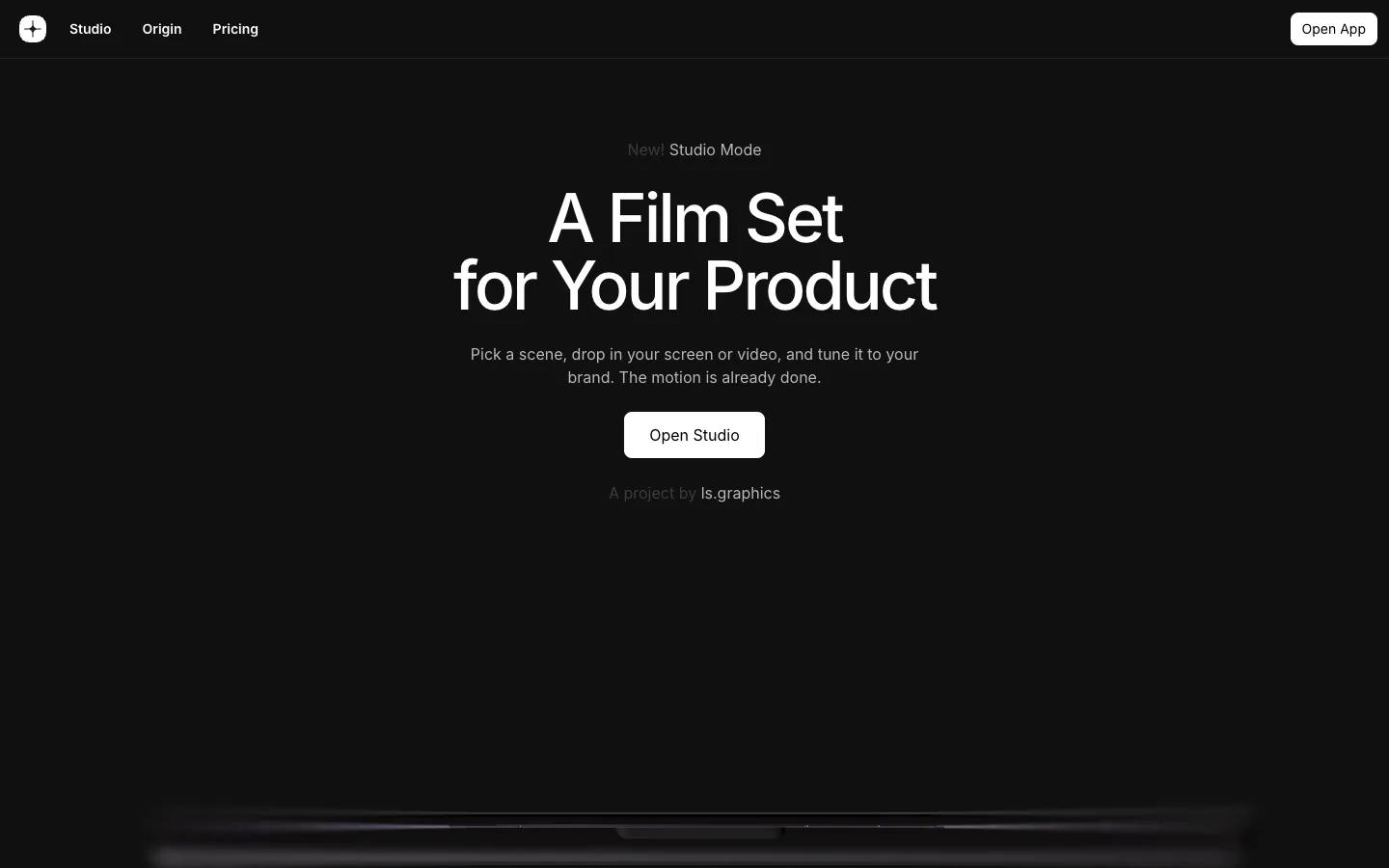
mckp.live
A dark, near-black product page for an animated mockup tool: centered Inter headline, a glowing device scene rising from the bottom of the first screen, and big product videos and preset grids with very little other colour.

Heart Aerospace
A hybrid-electric regional aircraft company shown through one full-bleed sky photograph of the ES-36 under a 130px white grotesque headline, then a 490px 'ES-36' wordmark that scrolls over the plane, a top-down aircraft render, and investor logos on white.
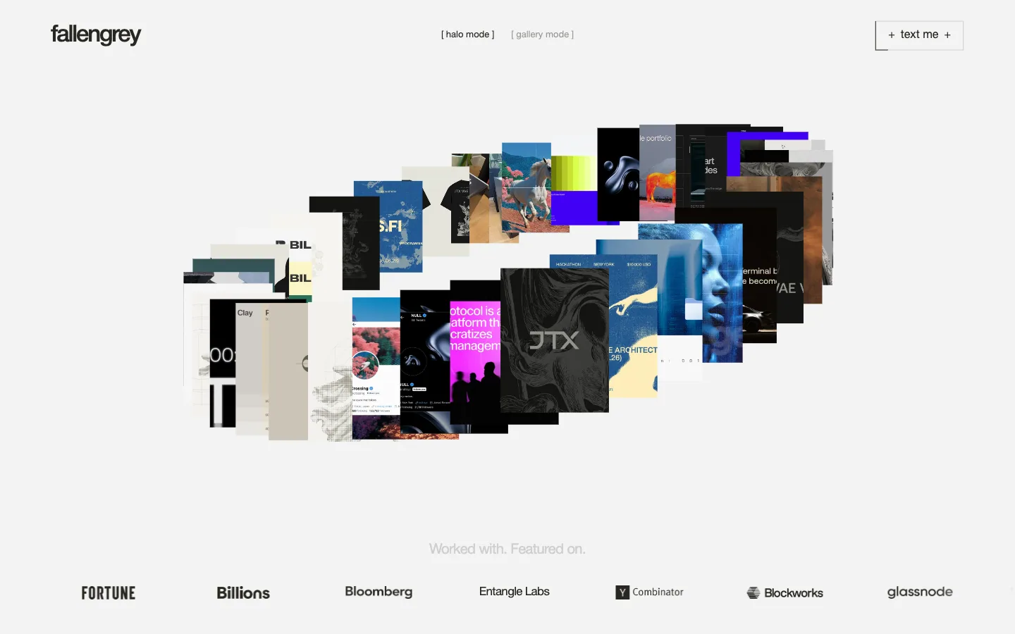
fallengrey
Portfolio and offer page for a one-person brand and web design studio. A ring of project thumbnails with a halo/gallery mode switch opens onto a client-logo strip, a short positioning statement, and three openly priced engagements in a sideways carousel.
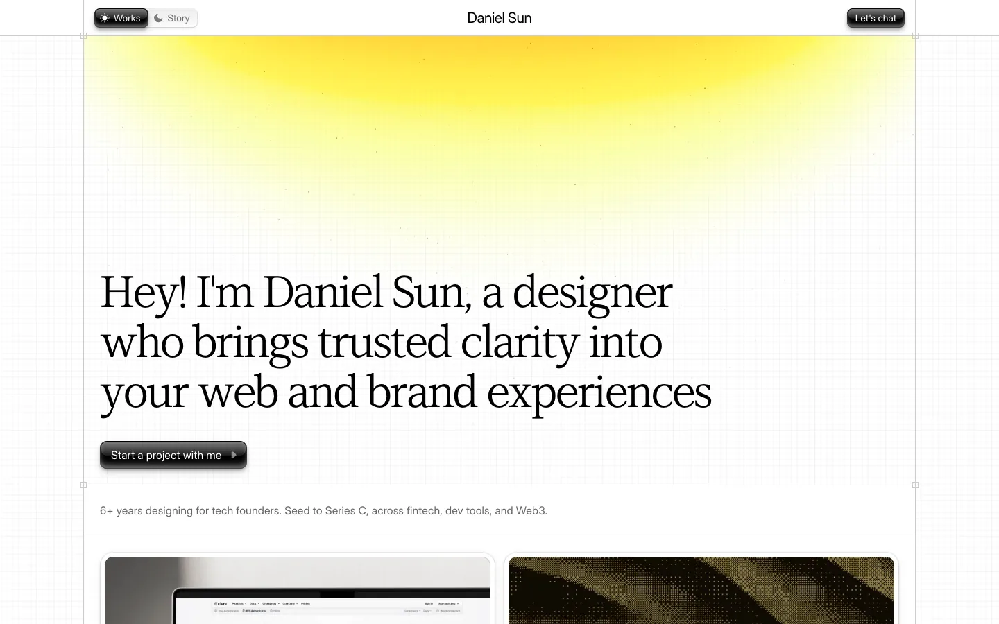
Daniel Sun
A designer's personal site on a faint blueprint grid: a soft yellow sun glow over a large serif headline, glossy embossed buttons, and a masonry of branding and web project cards with a logo wall below.
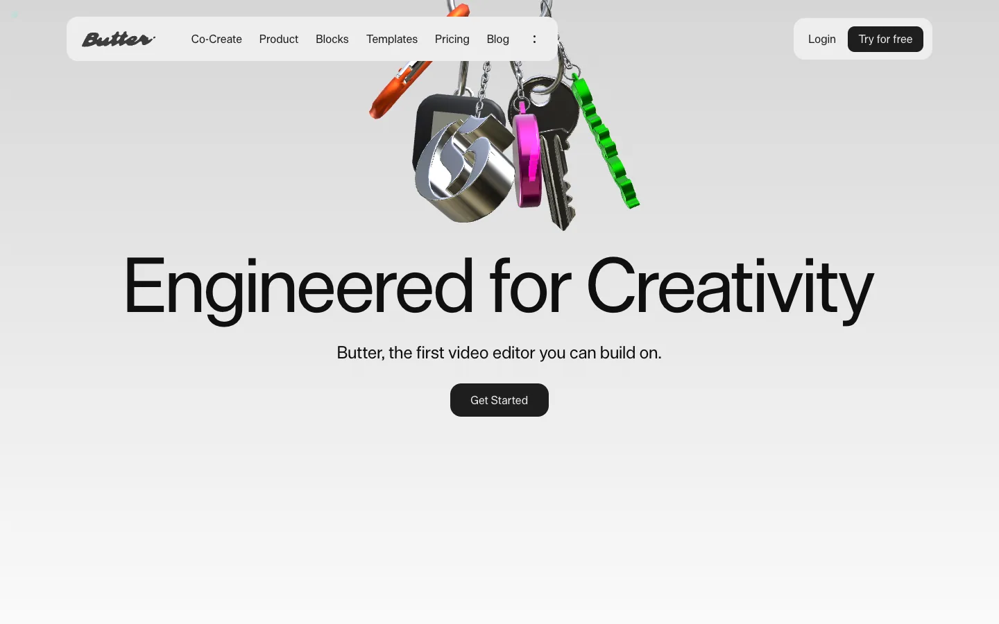
Butter
A video editor for creative teams on a soft grey canvas: chrome 3D keychain objects in the hero, very large grotesque headlines and dark product UI panels that show the editor at work.
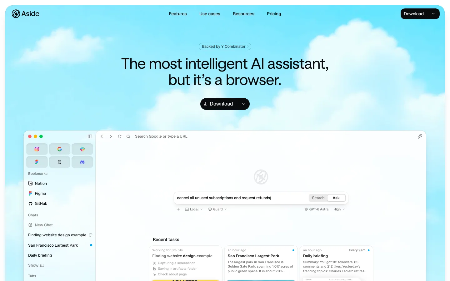
Aside
An AI browser app presented on a soft cloud-sky hero: a centered 48px grotesque headline, one black Download pill, and a frosted full-size mockup of the browser itself, then white sections with pastel-gradient task cards and a benchmark bar chart.
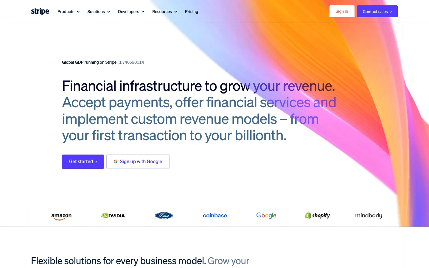
Stripe
Payments infrastructure for internet businesses. A white, airy page carried by a vivid animated mesh gradient and crisp product UI.
Questions.
What is a hero section?
A hero section is the first screen of a web page: usually a headline, one short supporting line, one main action and one strong visual. It has a few seconds to say what the site is and what to do next, so the best ones show one thing and leave space around it.
What should a hero section include?
A headline that says what the site offers in the audience's words, one supporting line, one primary action (or none, if the page's job is to show something), and one visual that is specific to the subject: the product, the work, a place or an object. Navigation sits above it.
How big should a hero headline be?
On the 11 published homepages in the library with a measurable headline, it ran from 48 to 133 px at 1440 px wide, with a median of 64 px. Our own rule of thumb caps it at 96 px, and at 72 px or more it should stay under 40 characters.
How tall should a hero section be?
One screen. Every hero measured here fills the first screen at 1440 × 900 and no more; a hero that needs scrolling to reach its action has lost the point of being first.
What is the difference between a hero section and above the fold?
Above the fold is whatever is visible before scrolling on a given screen. The hero is the designed first section of the page; on a large screen the fold may show the hero and the start of the next section.
Should a hero section use a carousel?
Prefer one static hero. If you must rotate, keep it to five frames or fewer, with visible controls, a clear current state and no autoplay.
Sources
- whata.design measurements of five hero sections on their live sites at 1440 × 900, 16 November 2026
- whata.design captures of 14 published homepages at 1440 × 900 and 390 × 844, November 2026
- whata.design Quality Bar: rules for the first screen, headline proportion, contrast on media and loading