Making Software
A reference book about how software works, set like a technical manual: a pixel-font masthead in electric blue, serif body text in columns, and blue line-drawn isometric diagrams with FIG_ captions on a faint dot grid.
What to steal.
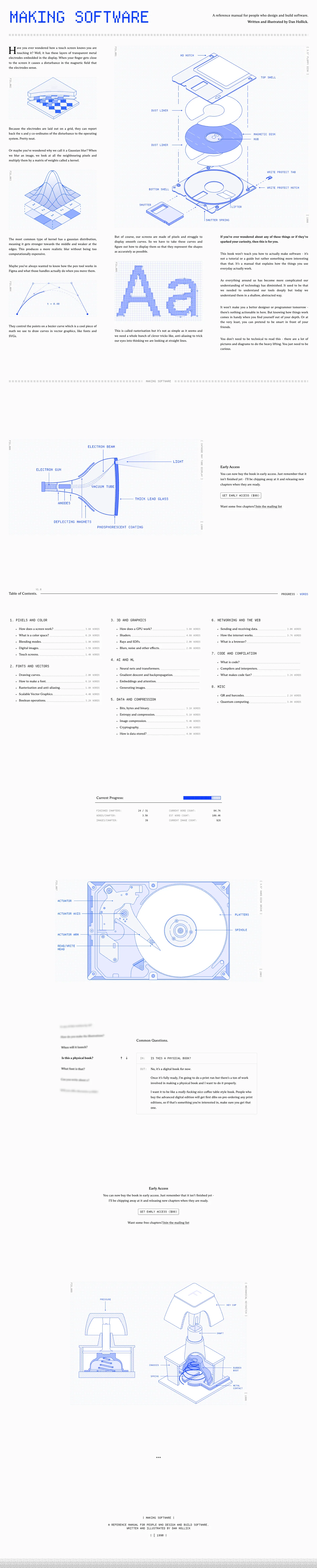
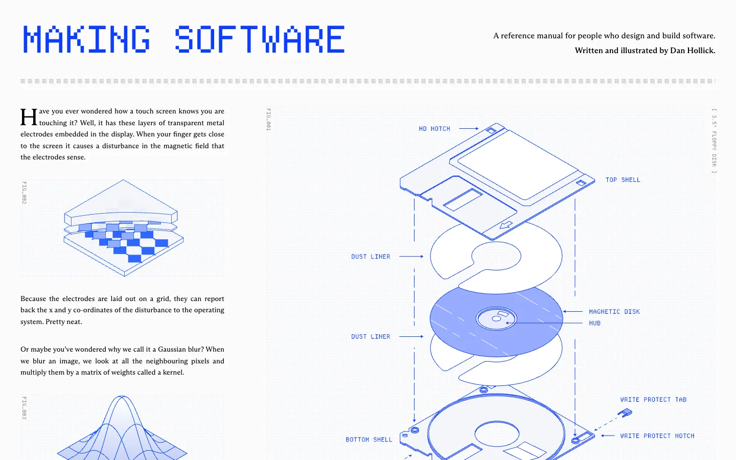
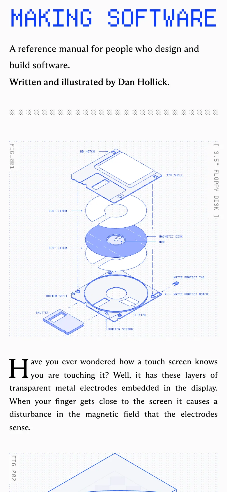
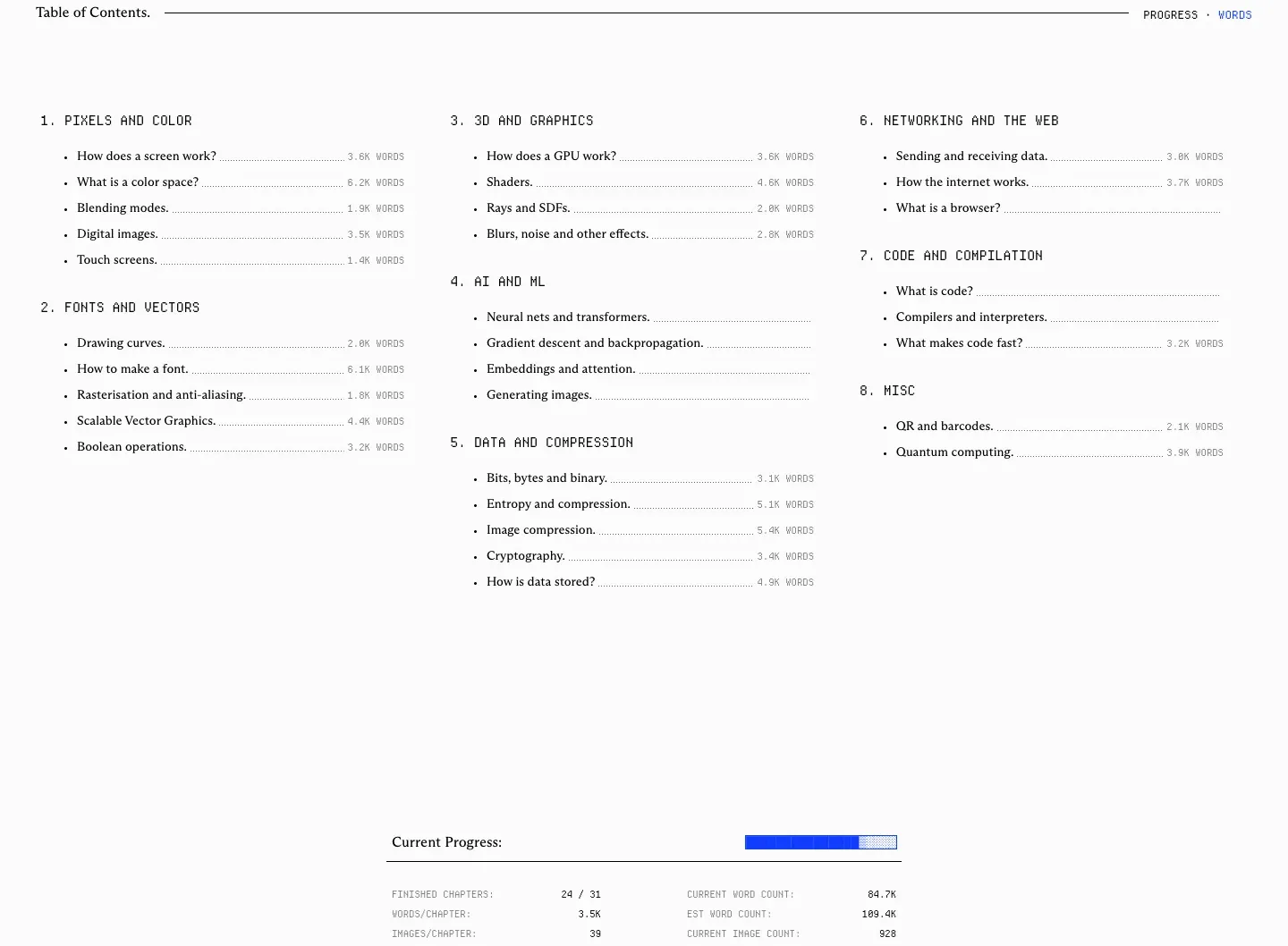
Every explanation is a figure: a floppy disk exploded into labelled layers, a touch screen's electrode grid, a hard drive, a keyboard switch, all drawn in one blue line style, so the product (a book) is shown by its own content and no stock imagery is needed. Monospace pixel type is used only for the masthead, labels, captions and the table of contents, while the reading text stays in a calm serif with a drop cap, which separates 'annotation' from 'prose' very clearly. One accent blue on near-white, and the first words of the book are the pitch, with real questions ('Have you ever wondered how a touch screen knows you are touching it?') instead of a feature list. Table of contents with word counts and a live progress panel ('finished chapters') make an unfinished product feel honest. Study the figure system and the label/prose type split. Watch out for: the primary action ('Get early access ($99)') sits about 2200px down, far below the first screen; body text is 14px with low-contrast grey labels at 10px; the page has no skip link or heading structure for the lists.
Sections measured from Making Software.
Ask your agent.
With the whata.design MCP, an agent can pull this site's facts and its measured sections: “Design a hero like Making Software's, editorial and utilitarian, for my product.”
The full page.