Dark mode design: grounds, contrast, and CSS that never flashes.
By Max Zeshut, Tech Lead · Updated 2026-11-17
The short answer
Dark mode design is building a dark colour scheme as its own palette, not an inverted light one: a near-black ground, surfaces that get lighter as they rise, off-white text and desaturated accents, each pair checked for WCAG contrast. On the web it follows prefers-color-scheme, with a saved choice applied before the first paint.
One set of tokens, two schemes.
A ground and three surfaces, each a step lighter, with the same text, link, button and field on every step. Switch it to light: the markup is unchanged, only the tokens swap. Every pair passes WCAG contrast in both schemes.
Continue
The hex values and ratios in the demo are for the dark scheme.
Why not just invert.
White on black is 21 : 1, the maximum, so an inverted page passes WCAG. It still reads worse than it should, for three reasons:
- Glare. Pure white text glows and bleeds on a dark ground. The web.dev guide to dark mode uses an off-white for text for this reason, and an almost-black ground rather than #000.
- No room for depth. On black there is nothing darker to put behind a card. Google's Material guidance starts dark surfaces at #121212 and makes each raised layer lighter, so elevation stays visible without shadows.
- Accents change. A colour tuned for white rarely survives the switch. The blue #0B5FCC passes as a link on white at 5.96 : 1, but drops to 3.17 : 1 on the dark ground above. Material notes that saturated colours “vibrate” on dark backgrounds; lighter, softer tints read better.
So the dark scheme is a second palette, designed and checked on its own, sharing names with the light one. CSS filters such as invert() on the page root flip photos and brand colours too; never use them as a dark mode.
Ground, surface and elevation.
Light interfaces show depth with shadows. On a dark ground a shadow has almost nothing to darken, so dark interfaces show depth with lightness: the higher a surface, the lighter it is. Material does this with a white overlay that gets stronger with elevation, on a #121212 base. Four steps are enough for most sites:
| Step | Colour | Text #E8EAED | Muted #A3A9B5 | Used for |
|---|---|---|---|---|
| Ground | #0F1115 | 15.68 : 1 | 8.01 : 1 | The page |
| Surface | #171A21 | 14.45 : 1 | 7.38 : 1 | Cards, sections |
| Raised | #1F232C | 13.05 : 1 | 6.67 : 1 | Hover, menus, sticky bars |
| Overlay | #282D38 | 11.44 : 1 | 5.84 : 1 | Dialogs, popovers |
The ground is tinted slightly blue rather than neutral grey; a hint of the brand hue keeps a dark page from looking like a switched-off screen. Keep the steps small: a jump of a few percent of lightness reads as a layer, a large one reads as a different section.
Text and accent colours that pass.
The thresholds do not change in the dark: body text needs 4.5 : 1, large text (24 px, or about 18.5 px bold) 3 : 1, and the edges of controls 3 : 1. What changes is where problems hide: in grey secondary text that looked fine on a bright monitor, and in accents too dark to read on a dark ground.
| Pair on the dark ground #0F1115 | Contrast | Needed |
|---|---|---|
| Text #E8EAED | 15.68 : 1 | 4.5 : 1 |
| Muted text #A3A9B5 | 8.01 : 1 | 4.5 : 1 |
| Link #7CB4FF | 8.84 : 1 | 4.5 : 1 |
| Dark label #0F1115 on a #7CB4FF button | 8.84 : 1 | 4.5 : 1 |
| White label on the same #7CB4FF button | 2.14 : 1 | Fails |
| Field border #7A8396 (3.62 : 1 on the overlay step) | 4.96 : 1 | 3 : 1 |
| Focus ring #FFD166 | 13.11 : 1 | 3 : 1 |
| Material's 87% white on #121212 (#E0E0E0) | 14.19 : 1 | 4.5 : 1 |
| Material's 60% white on #121212 (#A0A0A0) | 7.16 : 1 | 4.5 : 1 |
The button rows are the lesson most dark themes miss: a light accent that works as text cannot also carry white text. Put dark labels on light accent buttons, or keep a darker shade of the accent for filled buttons.
Measured on real sites.
The library's dark sites, with the text and background colours extracted from their captures and the contrast between them:
| Site | Text on ground | Contrast | What it shows |
|---|---|---|---|
| Frutiger Aero Archive | #DDE2D6 on #20281A | 11.54 : 1 | A green-tinted near-black, not #000; the green accent #6FB125 is 5.79 : 1 |
| mckp.live | #A6A8A8 on #0C0C0C | 8.19 : 1 | Ground #0C0C0C with #161616 surfaces (7.57 : 1); a faint #3B3B3B body text on #101010 is 1.70 : 1 |
| Orior AI | #827061 on #000000 | 4.44 : 1 | Pure black for a photo section; the warm grey passes for large text only, just short of 4.5 : 1 |
Two of the three use a ground a shade above black and a lighter step for surfaces, as above. The failures are the ones the tables predict: secondary greys chosen by eye. Orior AI's pure black works because it frames photographs, not long text; its off-white #F7F6F3 on black is 19.43 : 1.
Images and shadows.
- Photos. Bright photos dazzle on a dark page. The web.dev guide desaturates photos in dark mode (its default is
grayscale(50%)), citing research that people preferred slightly less vibrant images there. Never invert a photo. - Logos and diagrams on white. A white rectangle on a dark page is the loudest thing on it. Serve a dark version with
<picture>and<source media="(prefers-color-scheme: dark)">, or use a transparent background. - Icons. Inline SVG with
fill: currentColorfollows the text colour in both schemes with no extra files. - Shadows. Keep elevation in the surface colour. If a shadow is needed, for a menu over content, make it larger and darker than in light mode, and add a 1 px border a step lighter than the surface so the edge shows.
- Text over images. The same rule as in light mode: a scrim under the text, checked on the brightest part of the image.
prefers-color-scheme, and a toggle without a flash.
prefers-color-scheme reports whether the visitor's system is set to light or dark; it works in Chrome and Edge 76, Firefox 67 and Safari 12.1 and later. Follow it by default, and let people override it. The tokens:
/* 1. Tell the browser both schemes exist, before any CSS loads. */
<meta name="color-scheme" content="light dark">

/* 2. Light tokens by default. */
:root {
  color-scheme: light dark;
  --ground: #f5f5f7;  --surface: #ffffff;
  --text: #1d1d1f;    /* 15.46 : 1 on ground */
  --muted: #5e5e66;   /* 5.90 : 1 on ground */
  --link: #0b5fcc;    /* 5.47 : 1 on ground */
  --edge: #7d828c;    /* 3.54 : 1, for input and control borders */
}

/* 3. Dark tokens: from the system setting, unless the visitor chose light. */
@media (prefers-color-scheme: dark) {
  :root:not([data-theme="light"]) {
    --ground: #0f1115;  --surface: #171a21;
    --text: #e8eaed;    /* 15.68 : 1 on ground, 14.45 : 1 on surface */
    --muted: #a3a9b5;   /* 8.01 : 1 on ground */
    --link: #7cb4ff;    /* 8.84 : 1 on ground */
    --edge: #7a8396;    /* 4.96 : 1 on ground */
  }
}

/* 4. The same dark tokens when the visitor chose dark. */
:root[data-theme="dark"] {
  color-scheme: dark;
  --ground: #0f1115;  --surface: #171a21;
  --text: #e8eaed;  --muted: #a3a9b5;  --link: #7cb4ff;  --edge: #7a8396;
}
:root[data-theme="light"] { color-scheme: light; }

body { background: var(--ground); color: var(--text); }

/* Photos a little calmer in dark mode; icons follow the text colour. */
@media (prefers-color-scheme: dark) {
  :root:not([data-theme="light"]) img:not([src$=".svg"]) { filter: grayscale(50%); }  /* web.dev's default */
}
:root[data-theme="dark"] img:not([src$=".svg"]) { filter: grayscale(50%); }
svg.icon { fill: currentColor; }
The flash of the wrong theme happens when the page paints before the saved choice is applied. Apply it in the head, before the stylesheet, in a script small enough to cost nothing:
<!-- In <head>, before the stylesheet: runs before the first paint, so there is no flash. -->
<script>
  try {
    var t = localStorage.getItem("theme");          // "light", "dark" or null (follow the system)
    if (t === "light" || t === "dark") document.documentElement.dataset.theme = t;
  } catch (e) {}
</script>

<!-- The toggle: store the choice and set the attribute. -->
<button type="button" id="theme" aria-pressed="false">Dark mode</button>
<script>
  var b = document.getElementById("theme");
  var dark = () => document.documentElement.dataset.theme === "dark" ||
    (!document.documentElement.dataset.theme && matchMedia("(prefers-color-scheme: dark)").matches);
  b.setAttribute("aria-pressed", dark());
  b.onclick = () => {
    var next = dark() ? "light" : "dark";
    document.documentElement.dataset.theme = next;
    try { localStorage.setItem("theme", next); } catch (e) {}
    b.setAttribute("aria-pressed", next === "dark");
  };
</script>- color-scheme makes form controls, scrollbars and the default canvas follow the theme. MDN recommends the meta tag in the head to help prevent screen flashes during load.
- light-dark() picks one of two colours by the active scheme, as in
color: light-dark(#1d1d1f, #e8eaed). It is Baseline since May 2024 and needscolor-scheme: light dark; with it, a token can hold both values in one line. - Frameworks. Setting the theme in a React effect runs after the first paint and flashes. Put the inline script in the document head, and suppress the hydration warning on the html element if your framework flags the attribute.
- The toggle is a real button with
aria-pressed, so its state is announced, not only shown by an icon.
Pitfalls.
- Checking contrast in one scheme only. Run the audit twice. A pair that passes in light can fail in dark, as the blue link above does.
- Grey secondary text by eye. The most common failure in the library's dark sites. Measure every grey.
- White labels on light accents. Accents get lighter in dark mode; their labels must get darker.
- Saturated neon for body text. Keep neon for large type, icons and borders; body text stays off-white.
- Hairlines that vanish. A #222 border on #111 is decoration, not an edge. Inputs and buttons need 3 : 1.
- A theme set after load. Any script that sets the theme after the first paint makes the page flash on every visit.
Real examples in the library.
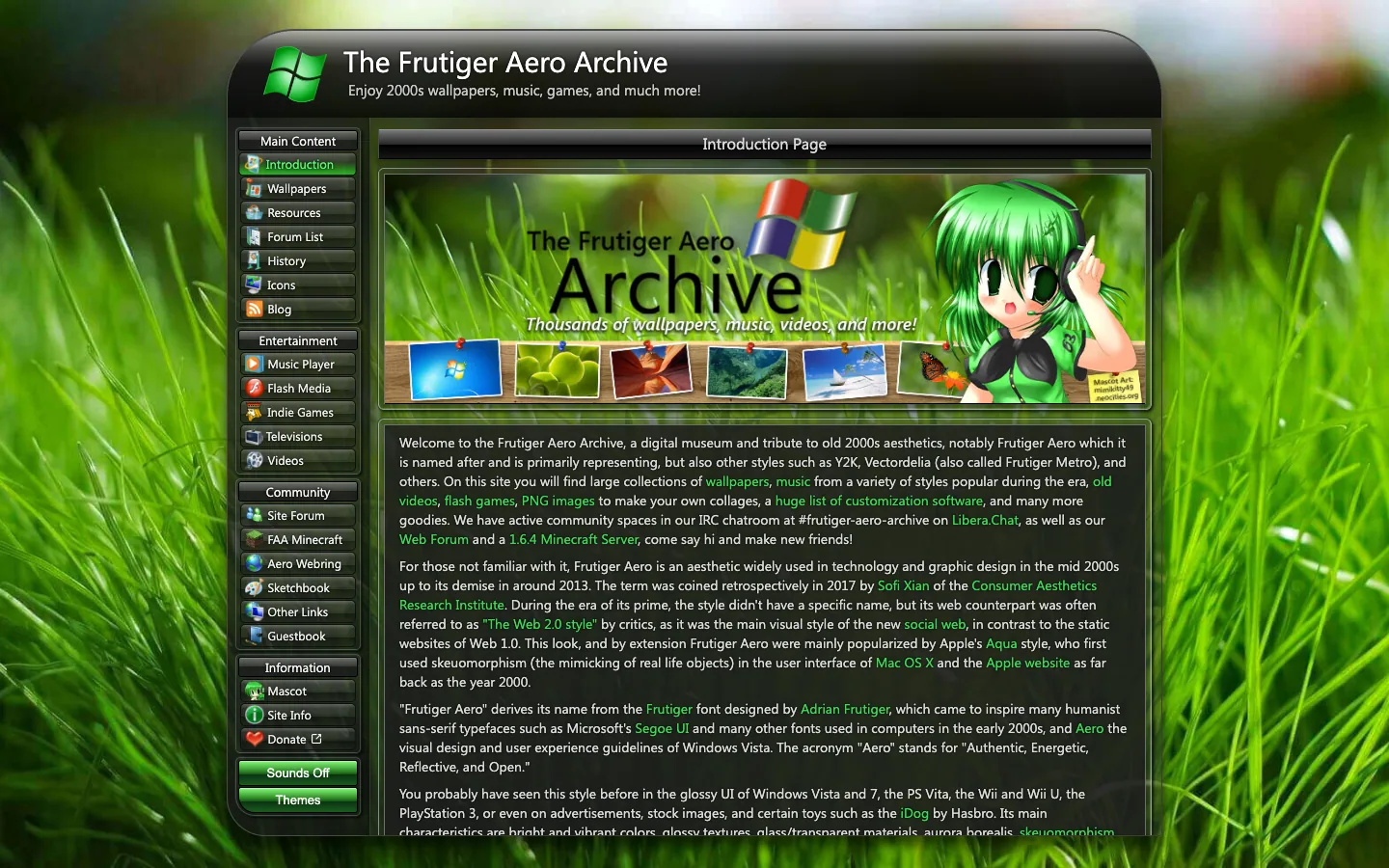
Frutiger Aero Archive
A fan-run museum of 2000s wallpapers, music, games and videos, built as a Windows Vista window: a glossy black title bar, a sidebar of glass buttons with icons, and a full-bleed close-up of green grass behind everything.

Orior AI
Landing page for an AI tool that keeps one character's face consistent across photos and videos, then posts them to social platforms. A pale hero of large portrait photography with face-match callouts turns into a black section of before/after image pairs and a logo strip.

mckp.live
A dark, near-black product page for an animated mockup tool: centered Inter headline, a glowing device scene rising from the bottom of the first screen, and big product videos and preset grids with very little other colour.
Questions.
What is dark mode design?
Dark mode design is building a dark colour scheme as its own palette, not an inverted light one: a near-black ground, surfaces that get lighter as they rise, off-white text and desaturated accents, each pair checked for WCAG contrast. On the web it follows prefers-color-scheme, with a saved choice applied before the first paint.
Should dark mode use pure black?
Usually not for the main ground. Pure white on pure black is 21 : 1, which passes WCAG, but bright text glows and bleeds on black, and a black ground leaves no darker step to show elevation. Google's Material guidance uses #121212 as its base dark surface. Pure black can still work for a cinematic section built around photography or video.
What colour should text be in dark mode?
An off-white, not #FFFFFF: something like #E8EAED on a #0F1115 ground (15.68 : 1). Secondary text can be a light grey such as #A3A9B5 (8.01 : 1). Material sets high-emphasis text at 87% white and medium at 60%, which on #121212 come to 14.19 : 1 and 7.16 : 1.
How do I add dark mode with CSS?
Define colours as custom properties, give them light values on :root and dark values inside @media (prefers-color-scheme: dark), and set color-scheme: light dark so form controls and scrollbars match. For a manual toggle, also apply the dark values under [data-theme="dark"] on the html element.
How do I stop the flash of the wrong theme on load?
Read the saved choice in a tiny inline script in the head, before the stylesheet, and set the data-theme attribute there. Add <meta name="color-scheme" content="light dark"> so the browser paints the right default background before your CSS arrives. A script at the end of the body, or a framework effect after hydration, runs too late.
Does dark mode save battery?
On OLED screens it can. Google reported power savings of up to 60% in Android case studies of its own apps, YouTube among them, according to web.dev. On LCD screens the backlight stays on, so the saving is small.
Sources
- web.dev, “prefers-color-scheme: Hello darkness, my old friend”, Thomas Steiner
- Google Codelabs, “Design a dark theme with Material and Figma”
- MDN Web Docs, color-scheme
- MDN Web Docs, light-dark()
- W3C, Understanding WCAG 2.2 Success Criterion 1.4.3: Contrast (Minimum)
- What a design! recipe “Dark, neon and atmospheric palettes that stay readable”
- What a design! library captures: Orior AI and mckp.live on 10 November 2026, Frutiger Aero Archive on 17 November 2026; palettes extracted from the captures
- Contrast ratios computed by What a design! with the WCAG 2 formula, 17 November 2026