Glassmorphism vs liquid glass, neumorphism and skeuomorphism: the materials of interface design compared.
By Max Zeshut, Tech Lead · Updated 2026-11-17
The short answer
Glassmorphism is a flat frosted panel: background blur, a translucent fill and a light border. Liquid glass, Apple's 2025 material, adds optics: it bends and highlights what is behind it and reacts to movement. Neumorphism extrudes soft shapes from a same-coloured ground; skeuomorphism imitates real materials. All four make a screen feel physical.
Five materials, side by side.
The same small panel, a name, a line and a button, in each material. Every text and edge colour passes WCAG contrast against the darkest thing that can sit behind it; the CSS is further down.
The liquid glass tile is the CSS approximation: blur, rim and sheen. Real refraction needs SVG filters or WebGL; see liquid glass.
At a glance.
| Style | Era and origin | How it looks |
|---|---|---|
| Skeuomorphism | Peaked in the early 2010s; Apple's iOS 7 (10 June 2013) replaced it with a flat, translucent design | Copies of real objects: leather, paper, metal, stitching, knobs; textures, gradients and drop shadows |
| Frutiger Aero | About 2004 to 2013: Windows Vista's Aero glass, the first iPhone, Mac OS X Leopard; named in 2017 | Glossy aqua buttons, glass and water, blue sky and green grass, humanist sans type |
| Neumorphism | 2019 to about 2021: a Dribbble banking-app concept by Alexander Plyuto; the name was coined in 2019 | Soft shapes the same colour as the ground, raised or pressed by a light shadow and a dark one |
| Glassmorphism | Named in 2020, the year macOS Big Sur brought frosted surfaces to the Mac | Flat frosted panels: blur, a white or tinted fill at 50 to 90%, a thin light border, over colour |
| Liquid glass | Apple, 9 June 2025, across iOS 26 and its other platforms | Thick, curved glass that bends what is behind it at the edges, with highlights that move |
Read as a line, these are one idea swinging back and forth. Skeuomorphism imitated objects; flat design removed the imitation in 2013, though iOS 7 already used translucency and layers. Neumorphism and glassmorphism brought depth back as abstract materials, and liquid glass makes the material behave like optics.
Building and using them.
| Style | Built on the web with | Accessibility risk | Use it for |
|---|---|---|---|
| Skeuomorphism | Gradients, inset highlights and layered box-shadow, textures as images or repeating gradients | Low: opaque surfaces and real edges. Weight and clutter are the cost | Tools whose metaphor helps (a mixer, a notebook), retro and nostalgic brands |
| Frutiger Aero | Sky gradients, a glossy ::before on buttons, light backdrop-filter panels | Low to medium: keep the gloss faint where labels sit | Nostalgic, friendly, eco and tech-optimist brands |
| Neumorphism | One background colour and paired box-shadow: a light one up-left, a dark one down-right | High: controls have no edge above 3 : 1, and pressed and raised states look alike | Decoration and large, single controls; add a border to anything pressable |
| Glassmorphism | backdrop-filter: blur(), a translucent fill, a 1 px light border, an opaque fallback | Medium: text over a changing backdrop, and no blur in some settings | One floating element: a nav bar, a chip, a modal over imagery |
| Liquid glass | Glassmorphism plus a rim, a sheen and stronger saturation; SVG feDisplacementMap or WebGL to refract | Medium to high: thin fills, motion; respect reduced transparency and motion | One hero object or a floating control layer, where the effect is the point |
Glassmorphism vs liquid glass.
- Blur against refraction. Glassmorphism blurs and tints the layer behind. Liquid glass also bends it at the edges, as a lens would.
- Border against rim. A glassmorphism panel has a thin light border. Liquid glass has specular highlights and a sheen that suggest thickness.
- Still against reactive. Liquid glass highlights shift with movement and adapt to what is underneath; glassmorphism stays as drawn.
- Cost on the web. Glassmorphism is a few lines of CSS that work in every current browser. The liquid glass look is the same CSS plus a rim and sheen; its refraction needs an SVG filter that, at the time of writing, only Chromium-based browsers apply through backdrop-filter, or a WebGL canvas.
Search demand reflects the overlap: “glassmorphism vs liquid glass” had 30 searches a month in the United States in November 2026, with a keyword difficulty of 8. Most “liquid glass” searches are about the iPhone setting, not the web.
Neumorphism vs glassmorphism.
Both arrived within a year of each other and both use soft shadows, but they solve depth in opposite ways. Neumorphism is opaque: a card is the same colour as the page and only its shadows show where it starts. Glassmorphism is transparent: the panel is lighter than its backdrop and the blur shows where it starts.
That difference decides accessibility. In the neumorphic tile above, the dark shadow #A3B1C6 reaches 1.72 : 1 against the #E0E5EC ground and the light one 1.27 : 1, well short of the 3 : 1 a control's edge needs. The tile's button passes only because it has a 1 px #6B778C border (3.57 : 1). The glass tiles pass because their fill stays at 70 to 82% white even with blur on.
Skeuomorphism vs glassmorphism.
Skeuomorphism copies particular things: the bookshelf, the leather binding, the brushed metal knob. Its value was teaching, a folder icon that looks like a folder; its cost was clutter and weight. Glassmorphism keeps a single abstract material and drops every texture. It is depth without imitation, which is why it ages better than skeuomorphism and reads as current next to flat layouts.
The CSS for each.
This is the CSS the demo above runs. The glass panels start opaque and turn translucent only inside @supports, and fall back to solid under reduced transparency.
.mat-grid { display: grid; grid-template-columns: repeat(auto-fit, minmax(200px, 1fr)); gap: 12px; }
.mat { position: relative; overflow: hidden; display: flex; align-items: flex-end;
       min-height: 210px; padding: 16px; border-radius: 18px; font: 15px/1.4 system-ui, sans-serif; }
.mat-panel { position: relative; width: 100%; padding: 16px; }
.mat-panel > * { position: relative; }  /* text above any sheen */
.mat-panel b { display: block; font-size: 17px; }
.mat-panel small { display: block; margin: 2px 0 12px; font-size: 13px; }
.mat-btn { position: relative; display: inline-block; padding: 8px 14px; font-size: 14px; font-weight: 600; }

/* Skeuomorphism: paper on linen, a lit blue button. */
.mat-skeuo { background: repeating-linear-gradient(0deg, rgb(0 0 0 / .03) 0 1px, transparent 1px 3px), #d9cfb8; }
.mat-skeuo .mat-panel { background: #fbf7ee; color: #2b2118;       /* 14.73 : 1 */
  border: 1px solid #c9bb9f; border-radius: 8px; font-family: Georgia, serif;
  box-shadow: inset 0 2px 0 #fff, 0 3px 8px rgb(60 40 10 / .25); }
.mat-skeuo small { color: #5c4d3b; }                                 /* 7.61 : 1 */
.mat-skeuo .mat-btn { background: linear-gradient(#2f6db8, #1f55a0); color: #fff; /* 5.25 : 1 on the lighter stop */
  border: 1px solid #173f78; border-radius: 6px;
  box-shadow: inset 0 1px 0 rgb(255 255 255 / .35), 0 1px 2px rgb(0 0 0 / .35); }

/* Frutiger Aero: sky, grass and a glossy aqua pill. */
.mat-aero { background: linear-gradient(transparent 78%, #7ed957 78%), linear-gradient(#5fb8f0, #bfe6ff 60%, #e9f8ff); }
.mat-aero .mat-panel { background: rgb(255 255 255 / .86); color: #0b3b60; /* 10.47 : 1 over the bluest sky */
  border: 1px solid #fff; border-radius: 16px; box-shadow: 0 6px 18px rgb(0 70 130 / .18); }
.mat-aero small { color: #2e5e80; }                                  /* 6.25 : 1 */
.mat-aero .mat-btn { background: #005a96; color: #fff; border-radius: 999px; } /* 7.23 : 1 */
.mat-aero .mat-btn::before { content: ""; position: absolute; inset: 1px 1px 50% 1px;
  border-radius: 999px 999px 40% 40%; background: rgb(255 255 255 / .15); } /* 5.14 : 1 under the gloss */

/* Neumorphism: same colour as the ground, lit by paired shadows. */
.mat-neu { background: #e0e5ec; }
.mat-neu .mat-panel { background: #e0e5ec; color: #2d3748;           /* 9.47 : 1 */
  border-radius: 20px; box-shadow: 9px 9px 16px #a3b1c6, -9px -9px 16px #fff; }
.mat-neu small { color: #4a5568; }                                   /* 5.94 : 1 */
.mat-neu .mat-btn { background: #e0e5ec; color: #2d3748; border-radius: 12px;
  box-shadow: 4px 4px 8px #a3b1c6, -4px -4px 8px #fff;
  border: 1px solid #6b778c; }  /* the fix: 3.57 : 1. The shadows alone reach 1.72 : 1 */

/* Glassmorphism and liquid glass share a colourful backdrop. */
.mat-glass, .mat-liquid { background: radial-gradient(circle at 20% 25%, #f472b6 0, transparent 45%),
  radial-gradient(circle at 85% 70%, #60a5fa 0, transparent 50%), #3b0764; }

/* Glassmorphism: opaque first, frosted where blur works. */
.mat-glass .mat-panel { background: rgb(255 255 255 / .9); color: #1e1033;
  border: 1px solid rgb(255 255 255 / .7); border-radius: 20px; box-shadow: 0 8px 32px rgb(31 10 66 / .25); }
.mat-glass small { color: #4b3a66; }
.mat-glass .mat-btn { background: #2b1b45; color: #fff; border-radius: 999px; } /* 15.61 : 1 */
@supports (backdrop-filter: blur(1px)) {
  .mat-glass .mat-panel { background: rgb(255 255 255 / .82);         /* text 11.68 : 1, small 6.56 : 1, even over black */
    -webkit-backdrop-filter: blur(16px) saturate(140%); backdrop-filter: blur(16px) saturate(140%); }
}

/* Liquid glass, the CSS approximation: thinner fill, stronger blur, a rim and a sheen. No refraction. */
.mat-liquid .mat-panel { background: rgb(255 255 255 / .9); color: #1d1d1f;
  border: 1px solid rgb(255 255 255 / .7); border-radius: 28px;
  box-shadow: 0 10px 30px rgb(0 0 0 / .18), inset 0 0 0 1px rgb(255 255 255 / .5); }
.mat-liquid .mat-panel::before { content: ""; position: absolute; inset: 0; border-radius: inherit;
  background: linear-gradient(160deg, rgb(255 255 255 / .55), transparent 40%); pointer-events: none; }
.mat-liquid small { color: #3d3d45; }
.mat-liquid .mat-btn { background: #1d1d1f; color: #fff; border-radius: 999px; } /* 16.83 : 1 */
@supports (backdrop-filter: blur(1px)) {
  .mat-liquid .mat-panel { background: rgb(255 255 255 / .7);         /* text 7.94 : 1, small 5.07 : 1, even over black */
    -webkit-backdrop-filter: blur(14px) saturate(180%); backdrop-filter: blur(14px) saturate(180%); }
}

/* People who ask for less transparency get solid panels. */
@media (prefers-reduced-transparency: reduce) {
  .mat-glass .mat-panel, .mat-liquid .mat-panel { background: #f5f3f7; -webkit-backdrop-filter: none; backdrop-filter: none; }
  .mat-liquid .mat-panel::before { display: none; }
}
The glass fills were checked against black, darker than anything in the demo's backdrop:
| Pair | Contrast | Needed |
|---|---|---|
| Skeuomorphism: white on the button's lighter stop #2F6DB8 | 5.25 : 1 | 4.5 : 1 |
| Frutiger Aero: navy #0B3B60 on 86% white, over sky #5FB8F0 | 10.47 : 1 | 4.5 : 1 |
| Neumorphism: button border #6B778C on #E0E5EC | 3.57 : 1 | 3 : 1 |
| Neumorphism: the dark shadow alone | 1.72 : 1 | Fails |
| Glassmorphism: #1E1033 on 82% white, over black | 11.68 : 1 | 4.5 : 1 |
| Liquid glass: #1D1D1F on 70% white, over black | 7.94 : 1 | 4.5 : 1 |
| Liquid glass: grey #3D3D45 on 70% white, over black | 5.07 : 1 | 4.5 : 1 |
Which to choose.
- A product interface used every day: glassmorphism on one floating layer, everything else opaque.
- A launch page with one hero object: liquid glass, with real refraction only on that object.
- A nostalgic or playful brand: Frutiger Aero or skeuomorphism; both stay readable more easily than glass.
- Neumorphism: only as decoration or for a single large control, with a visible border and a clear pressed state.
The library has real skeuomorphic, Frutiger Aero and glassmorphism sites below; it has no neumorphism or liquid glass site yet. To see each style applied to a full set of components, open styles compared.
Real examples in the library.
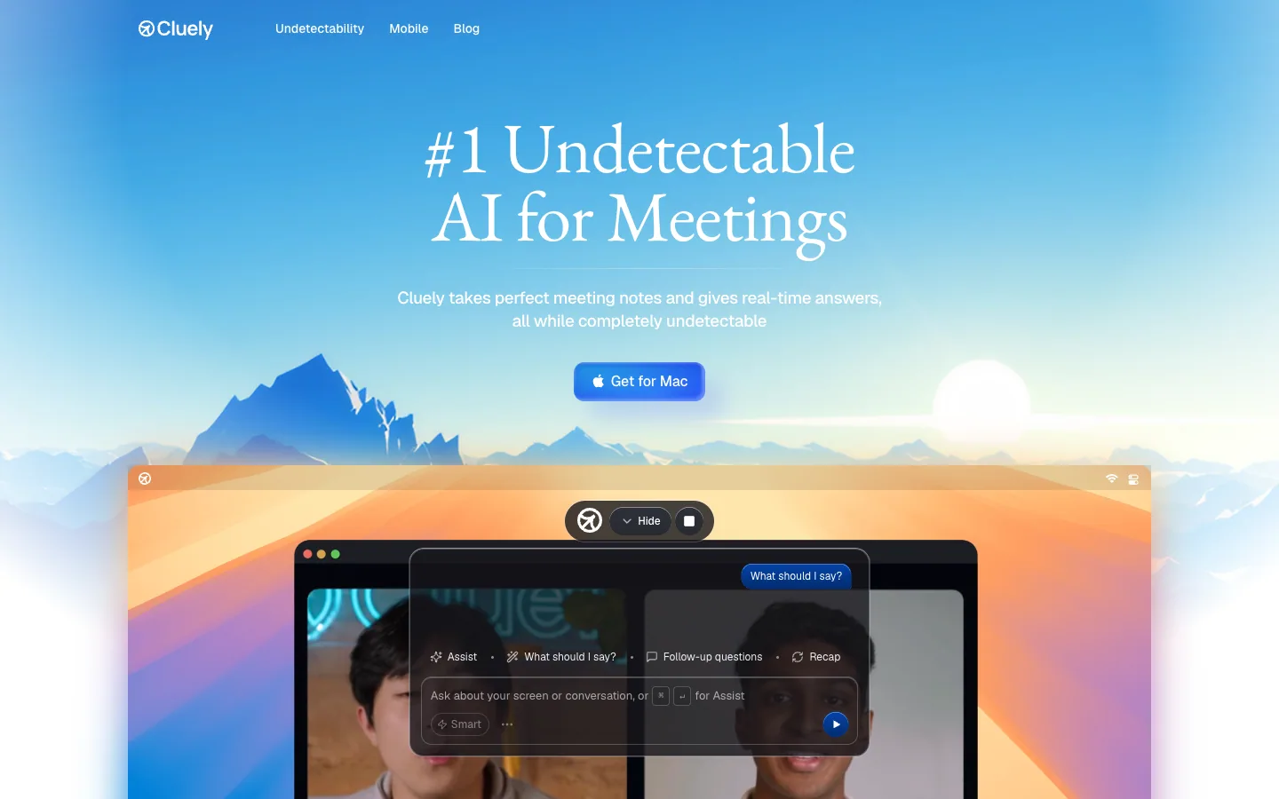
Cluely
AI meeting assistant site on a painted sky: a centred serif headline and a glossy blue download button over mountains at sunrise, with the product's frosted overlay floating on a video call below, then light pastel sections with stats, a FAQ and a closing band of soft 3D keys.
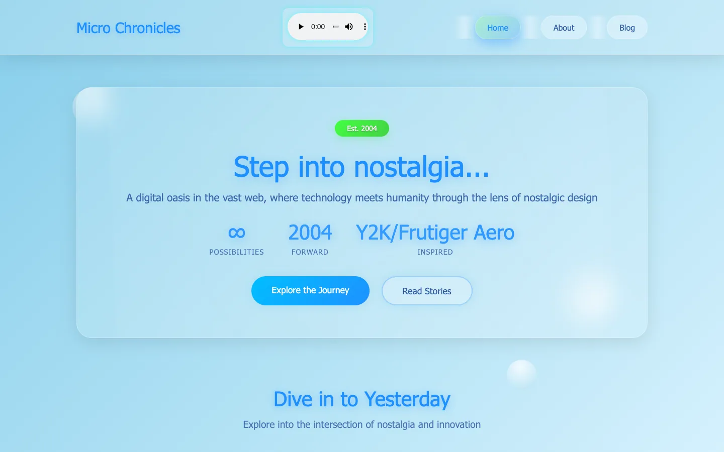
Micro Chronicles
A personal blog that reads Frutiger Aero through today's glassmorphism: a sky-blue page with floating bubbles, one large frosted panel, an aqua gradient button and a glossy green 'Est. 2004' pill.
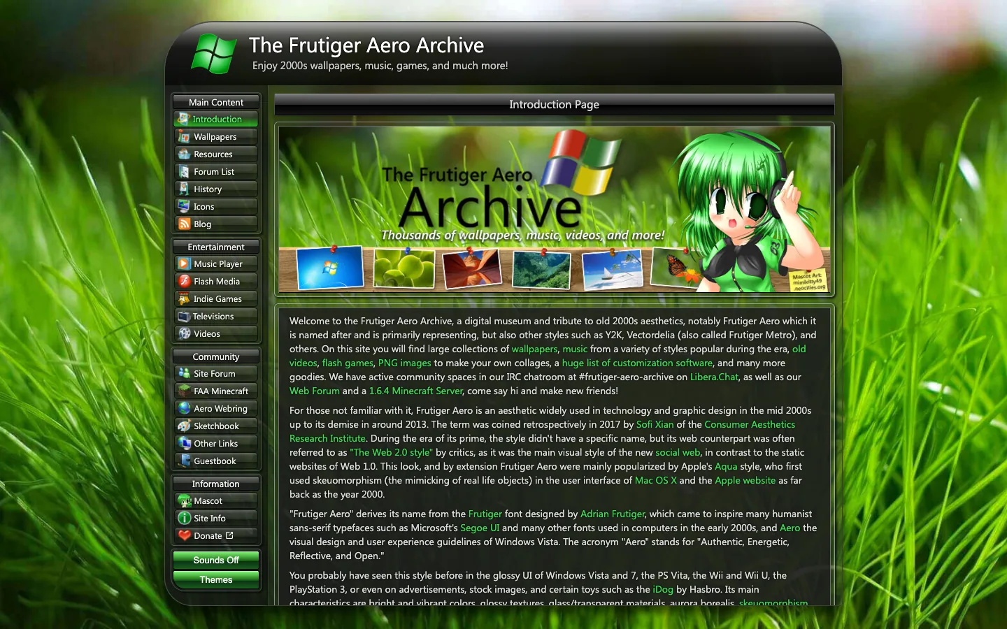
Frutiger Aero Archive
A fan-run museum of 2000s wallpapers, music, games and videos, built as a Windows Vista window: a glossy black title bar, a sidebar of glass buttons with icons, and a full-bleed close-up of green grass behind everything.
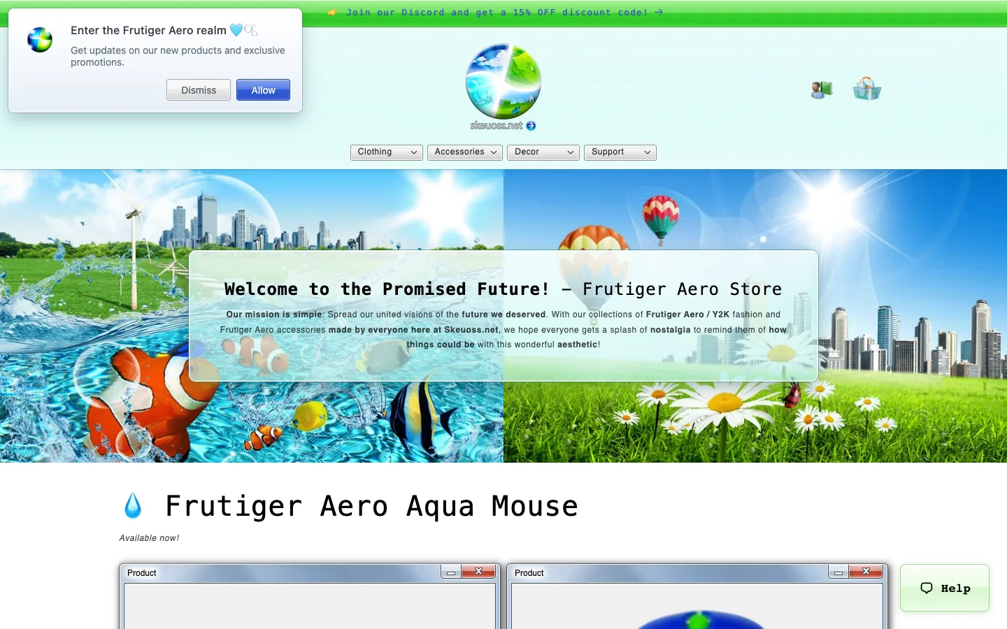
Skeuoss
A Frutiger Aero clothing and accessories shop that is the aesthetic in full: a glossy globe logo, a hero split between a clownfish reef and a sunny meadow with wind turbines and balloons, and a frosted glass panel welcoming you to 'the Promised Future'.

Aside
An AI browser app presented on a soft cloud-sky hero: a centered 48px grotesque headline, one black Download pill, and a frosted full-size mockup of the browser itself, then white sections with pastel-gradient task cards and a benchmark bar chart.
Questions.
What is the difference between glassmorphism and liquid glass?
Glassmorphism is a flat frosted panel: background blur, a translucent fill and a light border. Liquid glass, Apple's 2025 material, adds optics: it bends and highlights what is behind it and reacts to movement. Neumorphism extrudes soft shapes from a same-coloured ground; skeuomorphism imitates real materials. All four make a screen feel physical.
Is liquid glass just glassmorphism?
No. Both are translucent, but glassmorphism only blurs and tints what is behind a flat panel. Apple's Liquid Glass, announced on 9 June 2025, also refracts the content at its edges, catches specular highlights and responds to movement. On the web, CSS reproduces the frosted part; the bending needs an SVG displacement filter (Chromium only at the time of writing) or WebGL.
What is the difference between neumorphism and glassmorphism?
Neumorphism makes shapes that look pressed out of, or into, an opaque ground of the same colour, lit by a light shadow on one side and a dark one on the other. Glassmorphism makes see-through panels that blur a colourful backdrop. Neumorphism needs no backdrop; glassmorphism looks like nothing without one.
What is the difference between skeuomorphism and glassmorphism?
Skeuomorphism copies specific objects and their textures: leather, paper, metal, a real knob. Glassmorphism keeps one abstract material, frosted glass, and no textures. Glassmorphism is the depth that came back after flat design, without the imitation.
Which of these styles is the most accessible?
Skeuomorphism and Frutiger Aero are the easiest to keep readable, because their surfaces are opaque and their controls have real edges. Glass styles pass when the fill is tested against the darkest backdrop that can show through. Neumorphism is the hardest: its controls are the same colour as the page, so their only edges are shadows below 3 : 1 unless you add a border.
Is neumorphism still used?
Rarely. It spread in 2019 and 2020, and designer adoption fell by 2021, largely over its low contrast and buttons that do not look pressable. Its soft shadows live on in claymorphism and in subtle pressed states.
Sources
- Apple Newsroom, “Apple Unveils iOS 7”, 10 June 2013
- Apple Newsroom, “Apple introduces a delightful and elegant new software design”, 9 June 2025
- Nielsen Norman Group, “Skeuomorphism”, Megan Chan, 15 March 2024
- Nielsen Norman Group, “Glassmorphism: Definition and Best Practices”
- Wikipedia, “Neumorphism”, read 17 November 2026
- kube.io, “Liquid Glass in the Browser: Refraction with CSS and SVG”
- MDN Web Docs, backdrop-filter
- MDN Web Docs, prefers-reduced-transparency
- Contrast ratios computed by What a design! with the WCAG 2 formula, 17 November 2026
- Search demand: DataForSEO via Next Big, United States, 17 November 2026