Micro Chronicles
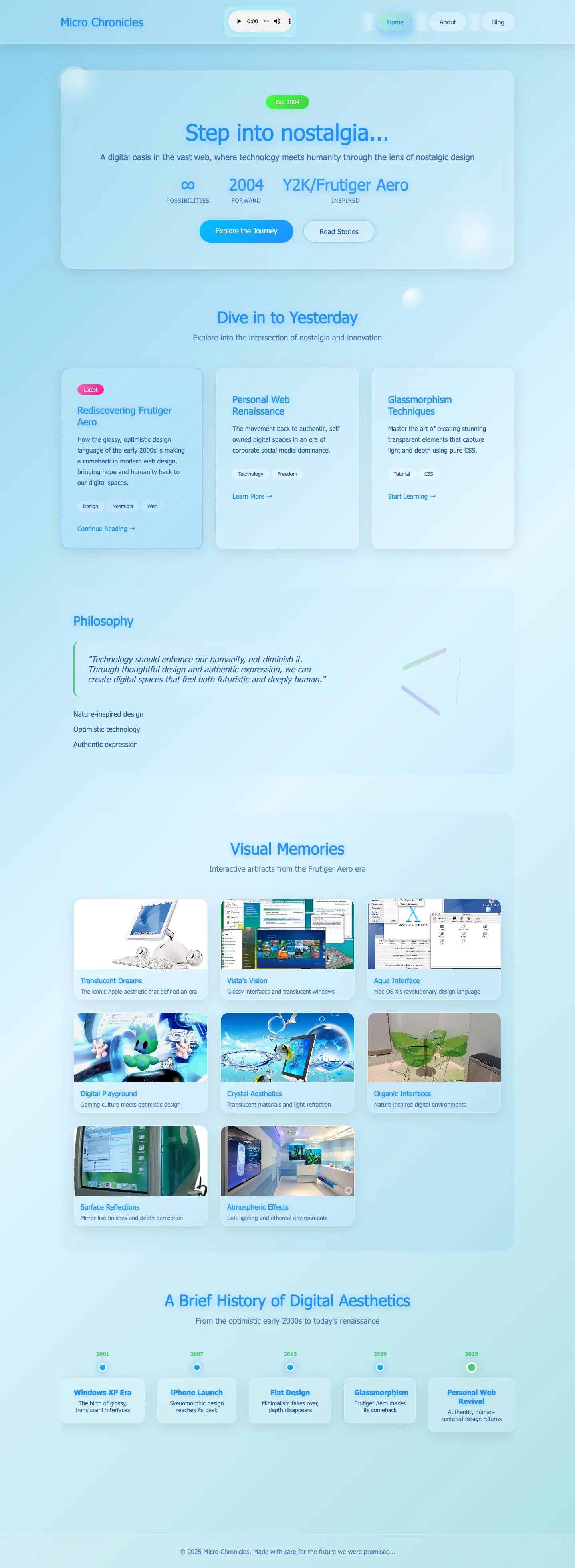
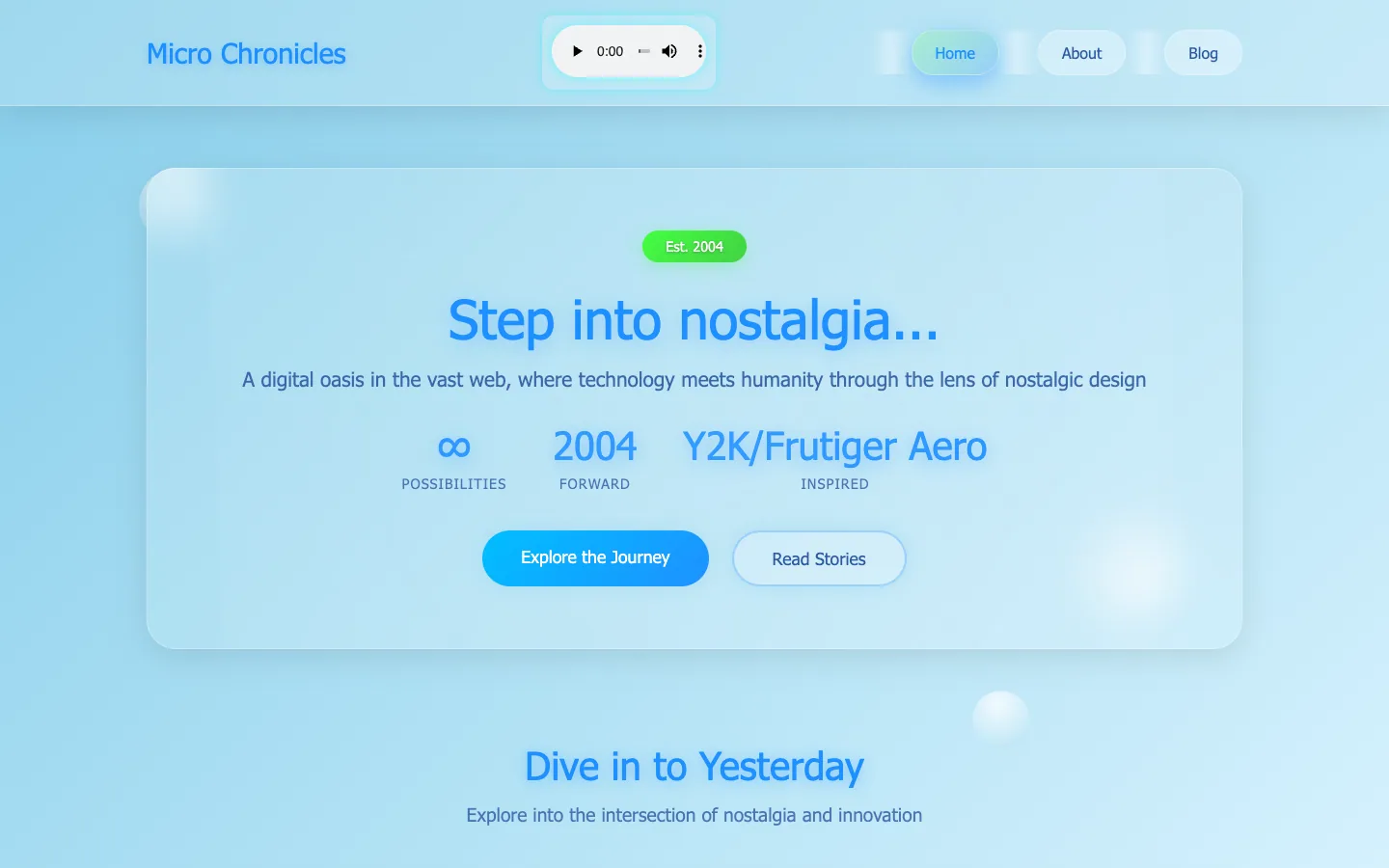
A personal blog that reads Frutiger Aero through today's glassmorphism: a sky-blue page with floating bubbles, one large frosted panel, an aqua gradient button and a glossy green 'Est. 2004' pill.
Style reference. In the library as an example of Frutiger Aero and Glassmorphism, not as a pick for a site built today. See the collection
What to steal.
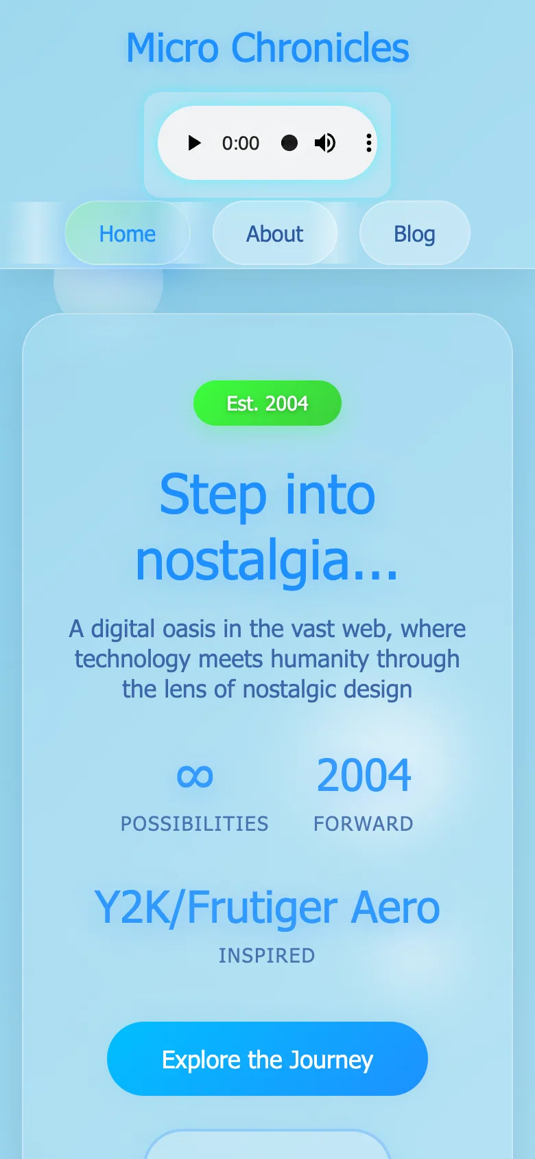
A modern revival rather than a recreation: the whole first screen is one frosted panel on a soft blue field, with translucent bubbles drifting at the edges, a centred 'Step into nostalgia…' headline in blue Segoe UI, three big stats ('∞', '2004', 'Y2K/Frutiger Aero') and a bright aqua gradient button beside a quiet outlined one. Pill-shaped navigation buttons and an embedded audio player in the header keep the playful early-web feel. Study the restraint, Aero colour and gloss on a flat modern layout, and the single frosted panel as the hero. Watch out for: light blue headings and white button text on light aqua are low in contrast, the stats repeat the tagline instead of saying anything, and several accessibility checks fail.
Ask your agent.
With the What a design! MCP, an agent can pull this site's facts and its measured sections: “Design a hero like Micro Chronicles's, frutiger aero and glassmorphism, for my product.”
The full page.