Minimalist web design: what it is, measured examples, and CSS that stays readable.
By Max Zeshut, Tech Lead · Updated 2026-11-17
The short answer
Minimalist web design removes everything that does not help the visitor: few elements, wide space, a near-neutral palette and type that carries the hierarchy. It is not an empty page. On the minimal sites in our library, neutrals cover 89 to 100% of the page, and the largest accent covers 5.1%.
Measured: what minimal looks like in the library.
Minimal is the most common style in the What a design! library: 10 of the 21 published sites carry it, twice as many as the next style (corporate clean, 5). The table reads each one's full-page screenshot, reduced to eight colours, and the fonts that set its text.
| Site | Ground, share of page | Neutral | Saturated colour | Type |
|---|---|---|---|---|
| fallengrey | #f3f3f3, 91% | 100% | None | Neue, one family |
| Bécane | #f6f6f6, 91% | 100% | None | Eurostile Becane, one family |
| Butter | #f7f7f7, 69% | 99% | #d3546f, 0.9% | DieGrotesk, one family |
| Aside | #fdfdfe, 77% | 94% | #99e4fc, 5.1% | A display face plus Geist |
| Shotbase | #fdfdfd, 62% | 89% | #194c8a, 2.6% | TWK Everett plus Google Sans |
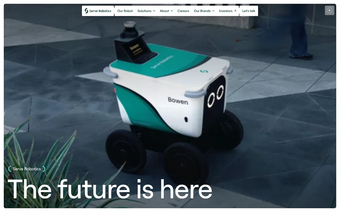
| Serve Robotics | #feffff, 63% | 91% | None | Roobert, one family |
| Heart Aerospace | #fdfdfe, 43% | 92% | None | One grotesque in text and display cuts |
| Pebble Flow | #f0ece6, 42% | 95% | None | Youth plus Aeonik |
| Orior AI | #000000, 45% (and #f7f6f3, 33%) | 95% | None | Geist, one family |
| mckp.live | #0c0c0c, 72% | 100% | None | Inter, one family (DM Mono for labels) |
- Quiet colour, not fewer colours. On the median minimal site, three colours cover 80% of the page; the other 11 sites in the library need three too. The difference is saturation: colours with almost none (OKLCH chroma under 0.04) cover 89 to 100% of every minimal page, median 95%, against a median of 83% and a low of 9% on the rest.
- Accents are small or absent. Only three of the ten have a saturated colour covering at least 0.4% of the page, and the largest covers 5.1%. Ten of the other eleven sites have one. Small accents such as a single orange button fall under that floor, so “none” here means none large enough to measure.
- The ground is light and rarely pure white. Eight of ten sit on a light ground: four within a step of white (#fdfdfd to #feffff, which may be white averaged with nearby pixels), three a soft grey (#f3f3f3 to #f7f7f7) and one a warm sand (#f0ece6). The other two are near-black or switch between black and off-white. The ground covers 42 to 91% of the page, median 66%.
- One family of type. Nine of ten are tagged grotesque, and seven set headlines and body in a single family; only two of the eleven other sites do. Five set headlines at weight 400 or 450, so the hierarchy comes from size, not weight.
- Big type is allowed. Minimal is not small. Measured at 1440 px wide on 16 November 2026, Butter's hero headline is 107.6 px and Heart Aerospace's 129.6 px; fallengrey has no headline at all and lets a ring of project cards lead.
Measured minimal heroes: Butter, Orior AI, Heart Aerospace, fallengrey.
Where it came from.
Nielsen Norman Group traces web minimalism to the Bauhaus and to the minimalist art of the 1960s, and to Mies van der Rohe's motto “less is more”. In interface design it runs through Edward Tufte's data–ink ratio (1983) and Jakob Nielsen's 1995 usability heuristics, one of which is minimalist design. On the web, NN/g credits Google as a pioneer in the early 2000s, and the style spread as designers turned away from the cluttered, skeuomorphic pages of that decade.
It is still current, though now under other names: in our count of the 31 latest Awwwards Sites of the Day in early November 2026, 12 were tagged “Clean” and 4 “Minimal”.
How to recognise it.
- Few elements per screen, with more space between groups than inside them.
- A neutral palette, often a warm or cool off-white, with one accent or none.
- One typeface, usually a grotesque, with a large headline and small, quiet text around it.
- Flat surfaces: hairlines or space instead of shadows, gradients and boxes.
- One strong subject per screen: a photo, the product, or the headline itself.
NN/g found the same traits on 112 minimalist sites in 2015: a limited palette on 95% (49% fully monochrome, 46% with one or two accents), maximised negative space on 84% and dramatic type on 75%.
Minimal is not empty.
A minimal page removes decoration, not information. Three things keep it from reading as unfinished:
- Hierarchy. With few elements, each one's size and position has to say how important it is. One headline clearly leads; a muted line under it; then the action.
- One accent, for one job. When colour is rare it points. Shotbase uses its one blue only on actions; Butter's only colour is its 3D hero objects.
- Real content. The measured sites fill their space with the thing itself: Bécane's row of 14 cut-out figures, Aside's full-size app window, Heart Aerospace's aircraft. A minimal page with a vague headline and stock imagery is just empty.
The first screen must still say what the page is and what to do, and show that more follows: let the next section peek in at the bottom edge, so the page does not look finished when it is not.
Build it in CSS.
The palette is the recipe's verified off-white set, with one blue added for the action. Every pair in the comments was computed with the WCAG 2 formula.
:root {
  --ground: #fafaf7;
  --ink:    #1a1a18;  /* on ground: 16.67 : 1 */
  --muted:  #6a6a64;  /* on ground: 5.20 : 1, the lightest grey for text */
  --edge:   #8c8c85;  /* on ground: 3.24 : 1, enough for field borders */
  --accent: #0b5cad;  /* on ground: 6.38 : 1; white on it: 6.67 : 1 */
}

body {
  margin: 0;
  background: var(--ground);
  color: var(--ink);
  font: 1.0625rem/1.6 system-ui, sans-serif;  /* body never under 1rem */
}

main { max-inline-size: 72rem; margin-inline: auto; padding-inline: 1.25rem; }
main > section { padding-block: 6rem; }       /* space does the grouping, not boxes */
p { max-inline-size: 55ch; }                  /* about 69 to 83 characters per line */

/* Type carries the hierarchy: one large step, the rest small. */
h1 {
  font-size: 3rem;
  line-height: 1.05;
  letter-spacing: -0.02em;
  overflow-wrap: anywhere;
}
@media (min-width: 48em) { h1 { font-size: 4.5rem; } }  /* stepped rem, so 200% text still doubles it */
.lede { color: var(--muted); }

/* The one accent, used only for the one action. */
.action {
  display: inline-flex;
  align-items: center;
  min-block-size: 44px;
  padding-inline: 1.25rem;
  background: var(--accent);
  color: #fff;
  text-decoration: none;
}

/* Restraint never removes these. */
input { min-block-size: 44px; border: 1px solid var(--edge); background: var(--ground); color: var(--ink); }
:focus-visible { outline: 3px solid var(--ink); outline-offset: 3px; }
nav a { display: inline-flex; align-items: center; min-block-size: 44px; color: var(--ink); }
Two values were measured in Chrome. A 55ch measure gave 69 to 83 characters per line across four common fonts, because ch is the width of a zero, wider than an average letter. And headline sizes stepped in rem at media queries reached double size at 200% text zoom, while sizes built from clamp() with vw did not.
Pitfalls.
- Light grey text. Lightening text is the easiest way to make a page look calmer, and the most common failure. On two of the eight light-ground sites in the library, the colour that sets the most text is a mid grey; against the page's main ground it measures 4.70 : 1 on one and 4.08 : 1 on the other, under the 4.5 : 1 that WCAG requires for body text. #6a6a64 on #fafaf7 (5.20 : 1) is as light as it should go.
- Hidden navigation. A menu icon on a wide screen saves little space and costs a lot. In NN/g's 2016 study of 179 people, desktop visitors used hidden navigation in 27% of cases against 48% for visible links, found content more than 20% less often and were at least 39% slower. Keep the main links visible wherever they fit.
- Invisible controls. Borderless fields, placeholder-only labels and tiny icon links. Fields need an edge at 3 : 1, a visible label, and targets of at least 24 px.
- No focus ring. Removing the outline to keep things clean leaves keyboard users lost. A solid ring in the text colour with an offset suits the style.
- Removing what people came for. Prices, the founder's name, what the product does: cutting these is not restraint.
On standard components.
The same navigation, buttons, badge, card, stat, form field and toggle every style in the wiki is shown on, in minimal. Every colour pair passes WCAG contrast. Compare it with seven other styles on one page.
Plan your week in minutes.
One calm place for the team's tasks, notes and deadlines.
Weekly review
Every Friday, see what moved and what is stuck.
Read the weekly reviewMinimal and its neighbours.
| Style | What it is | Colour |
|---|---|---|
| Minimal | Few elements, wide space, type and one subject lead | Neutrals, one accent or none |
| Swiss / grid-based | A strict grid, neutral grotesque type and strong alignment | Black, white and often one red |
| Corporate clean | A polished, conventional B2B page with clear sections and screenshots | White with blue accents |
| Flat design | A surface treatment: no gradients, highlights or shadows | Any, often bright |
| Neo-brutalism | Thick outlines, hard offset shadows, chunky buttons | Flat saturated colours |
Ask your agent.
The What a design! skill carries this recipe and its rules, so an AI agent building a minimal page keeps the contrast, focus and target checks. The MCP server adds the live library, including the minimal sites above. Try: “Build a minimal landing page from a minimal site in the What a design! library, then review it.”
Real examples in the library.
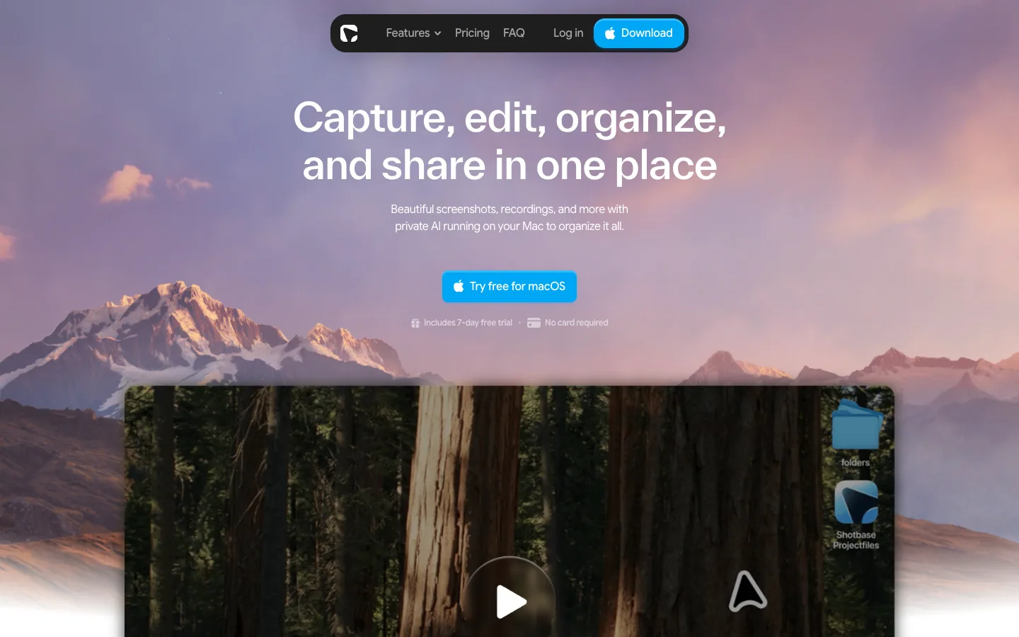
Shotbase
A Mac screen-capture app that dresses its homepage like macOS: a landscape-wallpaper hero, floating dark pill nav, and soft frosted product scenes on white.
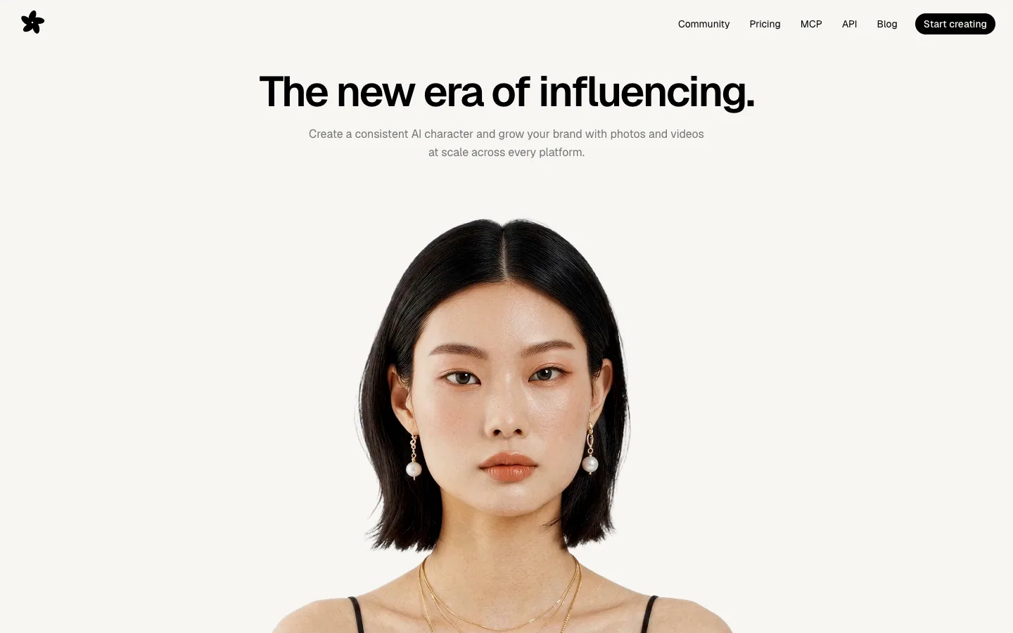
Orior AI
Landing page for an AI tool that keeps one character's face consistent across photos and videos, then posts them to social platforms. A pale hero of large portrait photography with face-match callouts turns into a black section of before/after image pairs and a logo strip.
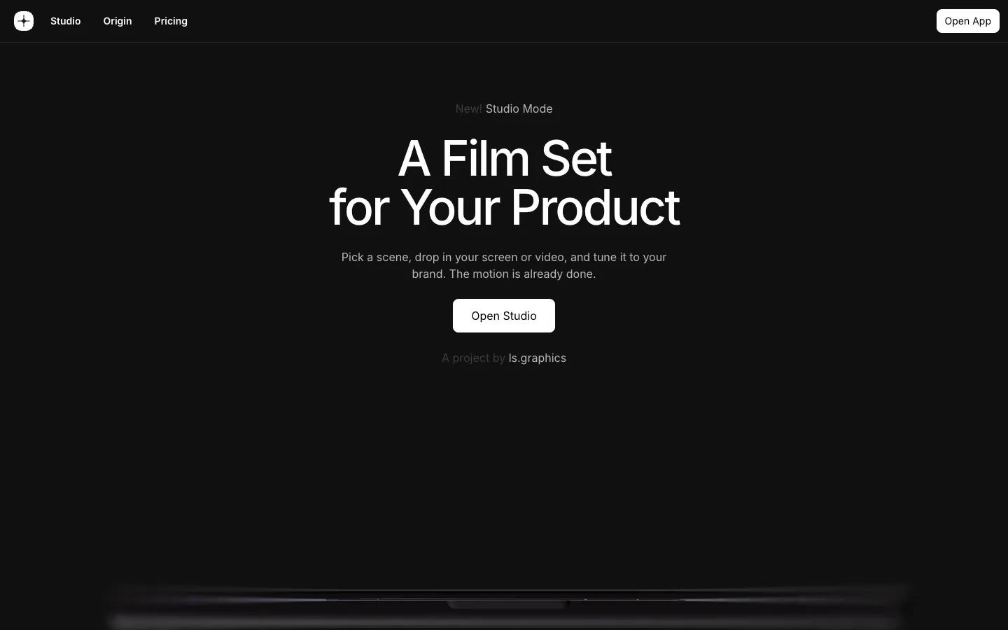
mckp.live
A dark, near-black product page for an animated mockup tool: centered Inter headline, a glowing device scene rising from the bottom of the first screen, and big product videos and preset grids with very little other colour.

Heart Aerospace
A hybrid-electric regional aircraft company shown through one full-bleed sky photograph of the ES-36 under a 130px white grotesque headline, then a 490px 'ES-36' wordmark that scrolls over the plane, a top-down aircraft render, and investor logos on white.
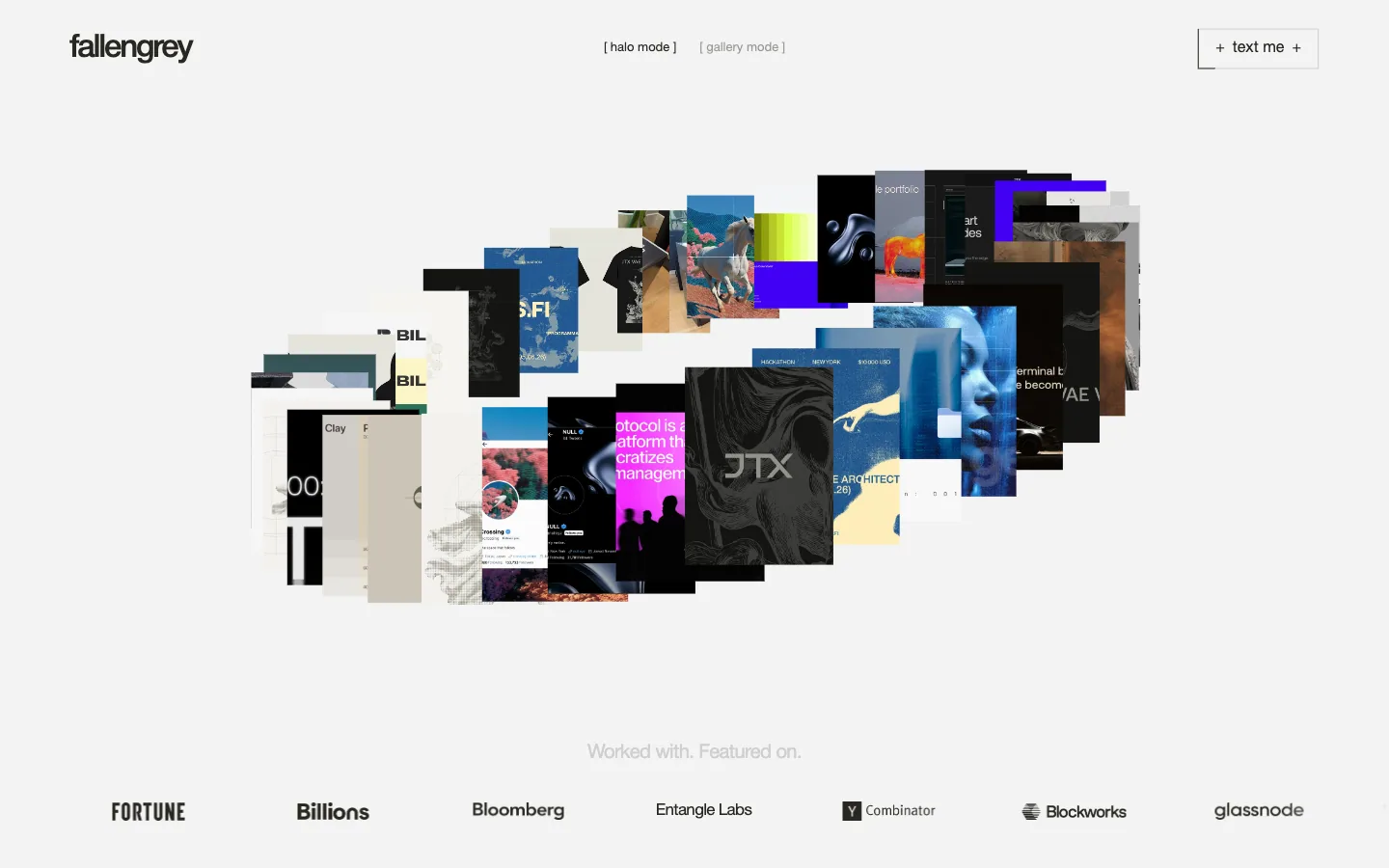
fallengrey
Portfolio and offer page for a one-person brand and web design studio. A ring of project thumbnails with a halo/gallery mode switch opens onto a client-logo strip, a short positioning statement, and three openly priced engagements in a sideways carousel.
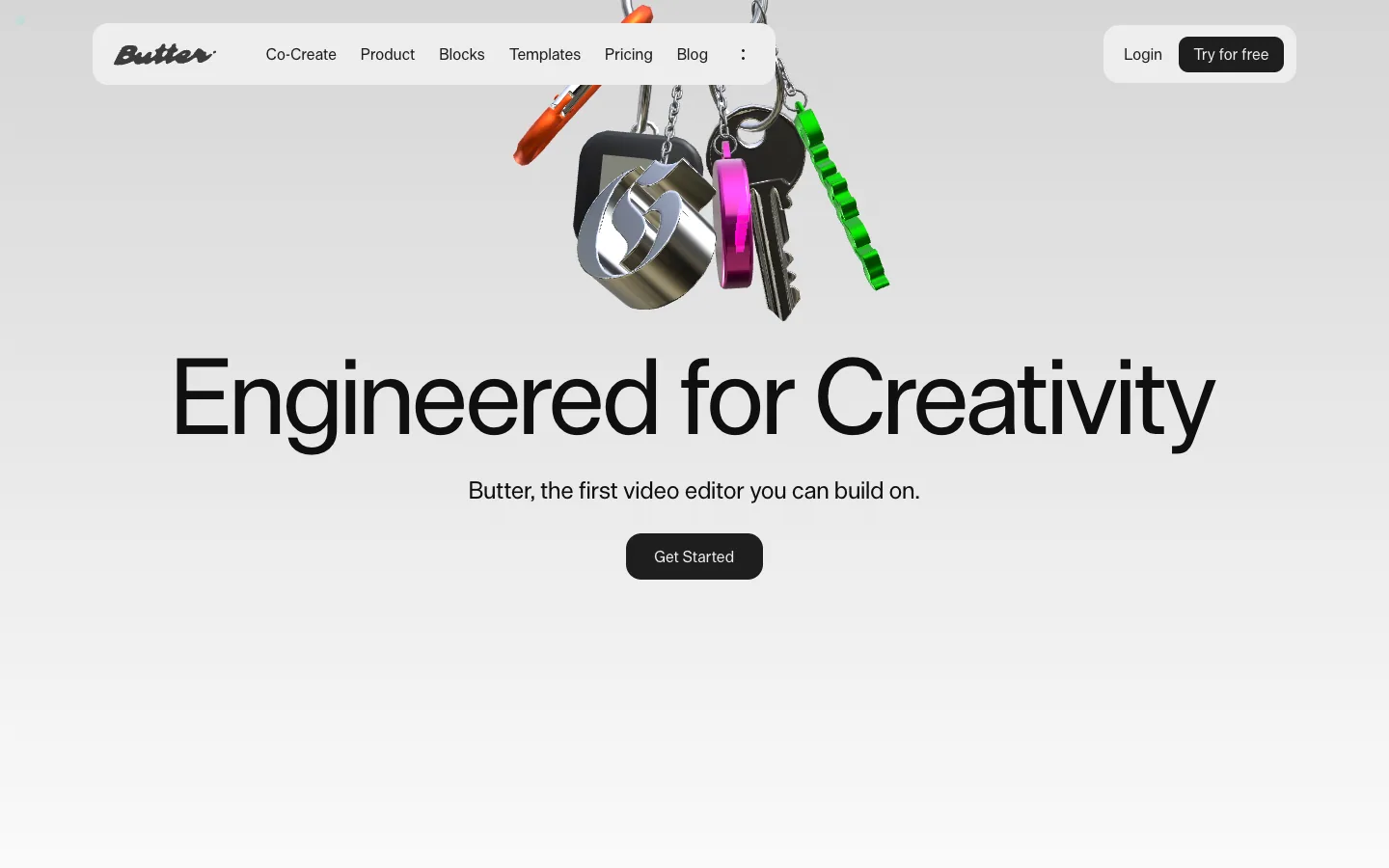
Butter
A video editor for creative teams on a soft grey canvas: chrome 3D keychain objects in the hero, very large grotesque headlines and dark product UI panels that show the editor at work.
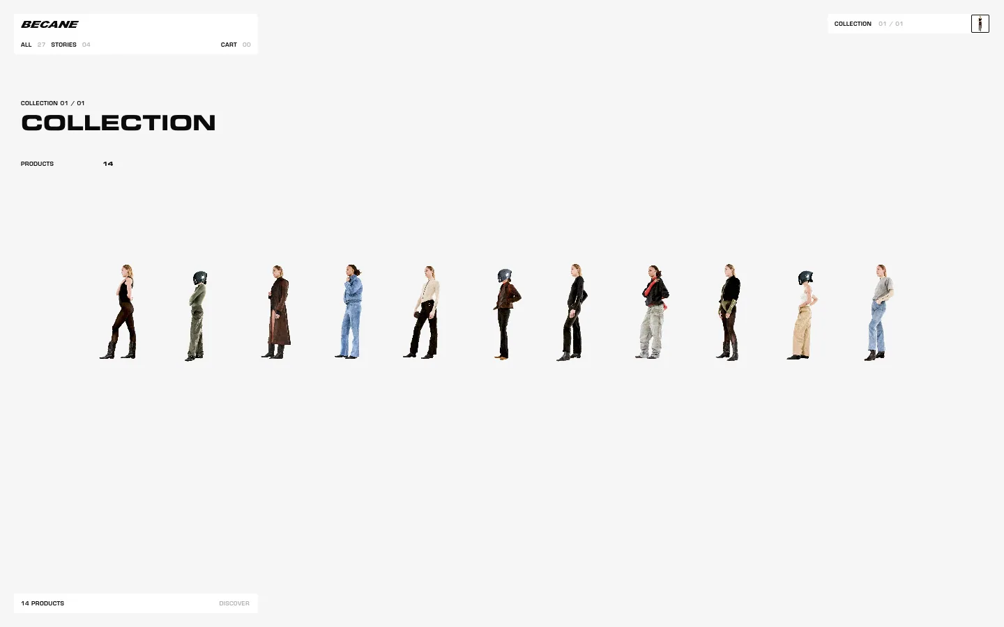
Bécane
Shop for a Paris womenswear label. A pale grey page holds a single row of 14 cut-out figures that scrolls sideways, small floating label bars for navigation, and one oversized extended-caps brand statement as the footer.
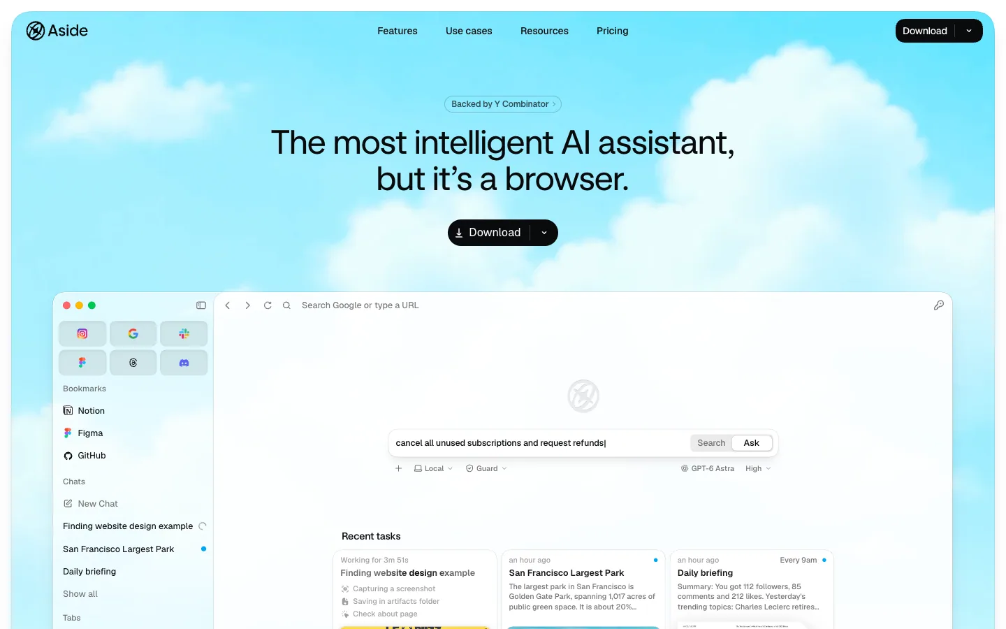
Aside
An AI browser app presented on a soft cloud-sky hero: a centered 48px grotesque headline, one black Download pill, and a frosted full-size mockup of the browser itself, then white sections with pastel-gradient task cards and a benchmark bar chart.
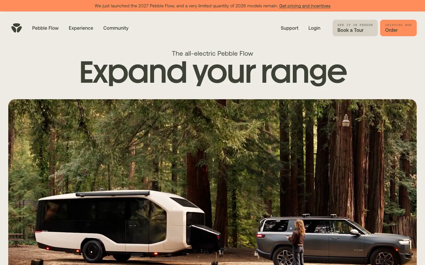
Pebble Flow
An all-electric travel trailer. A warm sand page with a big rounded headline over lifestyle photos, carousels of features and use cases, a self-powered split section and a dark interior photo inviting a tour.
Serve Robotics
Sidewalk delivery robots. A full-bleed photo of the robot in the street, then a white page where its two round eyes become a scroll animation, cut-out robot renders alternate with short statements, and a partner strip.
Questions.
What is minimalist web design?
Minimalist web design removes everything that does not help the visitor: few elements, wide space, a near-neutral palette and type that carries the hierarchy. It is not an empty page. On the minimal sites in our library, neutrals cover 89 to 100% of the page, and the largest accent covers 5.1%.
What are the characteristics of minimalist web design?
A near-neutral palette with one accent or none, wide negative space, few elements per screen, flat surfaces without heavy shadows, and type that does the work of decoration. Nielsen Norman Group found a limited palette on 95% of 112 minimalist sites in 2015 and generous negative space on 84%.
What colours does a minimalist website use?
Mostly neutrals. On the ten minimal sites in our library, colours with almost no saturation cover 89 to 100% of the page (median 95%). Eight sit on a light ground, from almost white to a warm sand (#f0ece6), and only three have a saturated accent large enough to measure, covering 0.9 to 5.1% of the page.
What fonts are used in minimalist web design?
Mostly one grotesque sans serif. Nine of the ten minimal sites in our library are tagged grotesque, and seven set headlines and body text in a single family (Inter, Geist, Roobert and custom grotesques among them). Half set their headlines at weight 400 or 450 and get hierarchy from size alone.
Is minimalist design good for usability?
Removing what does not help the visitor usually helps. It turns bad when it removes things people need: navigation hidden behind an icon, light grey text, borderless fields or the information that answers why the visitor came. Keep text at 4.5:1 contrast, borders and focus rings at 3:1, and the main links visible.
What is the difference between minimalism and flat design?
Flat design is a surface treatment: no gradients, highlights or shadows. Minimalism is a content and layout strategy: fewer elements, more space, one clear hierarchy. Most minimal sites are flat, but a flat page crowded with elements is not minimal.
Sources
- What a design! library snapshot of 17 November 2026: palettes and fonts of the 21 published sites, 10 of them tagged minimal
- What a design! measurements of hero sections on their live sites at 1440 × 900, 16 November 2026
- What a design! recipe “Minimal and quiet-luxury pages that remain clear and usable”, contrast pairs computed with the WCAG 2 formula; line lengths and text zoom measured in Chrome on 5 and 6 November 2026
- What a design! trend research, 5 November 2026: tags on the 31 latest Awwwards Sites of the Day
- Kate Moran, “The Roots of Minimalism in Web Design”, Nielsen Norman Group, 28 June 2015
- Kate Moran, “The Characteristics of Minimalism in Web Design”, Nielsen Norman Group, 12 July 2015
- Kara Pernice and Raluca Budiu, “Hamburger Menus and Hidden Navigation Hurt UX Metrics”, Nielsen Norman Group, 26 June 2016
- W3C, Understanding WCAG 2.2 SC 1.4.3 Contrast (Minimum)