Shotbase testimonials section
social-post quote cards in four staggered columns
Real people talking about the work in their own words, set as a calm wall of social posts: a small pill eyebrow, a centred two-line heading, then four columns of soft white cards that start level and end ragged. Each card is a quote over a round avatar, a bold name and a quieter handle; a few cards are a picture instead. The cards fade in one by one as they reach the reader. It fails when the cards look like a template testimonial slider, when quotes are shortened or cut off, when the columns line up in rows, or when a quote is invented.
Measured on the live shotbase.com section “Loved by many” on 2026-11-17 at 1440×900.
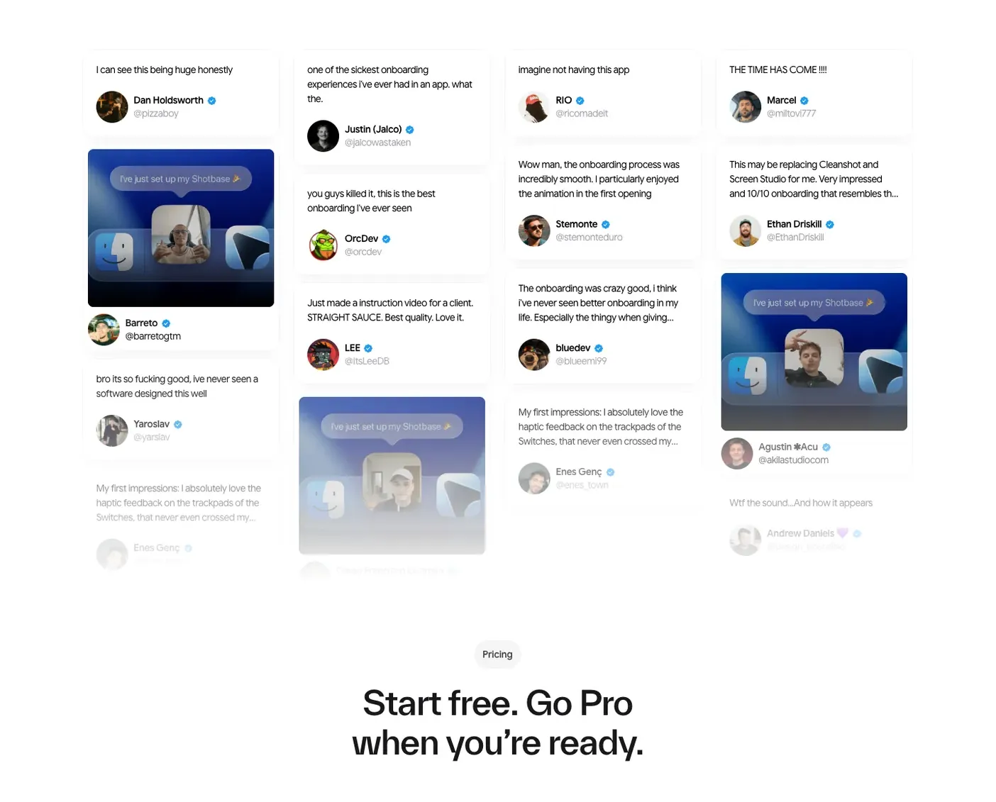
Stack
Plain DOM. A flat list of figure cards in reading order, laid out with CSS multi-column (column-count), so columns fold without a script. sections.js adds the fades (IntersectionObserver, no rAF loop); CSS owns the transitions. No hover state (the source has none).
Layout (pinned)
- Section: full bleed, padding 80 px 20 px 80 px (source 80 px 20 px 0, with the bottom of the columns faded out; see the accessibility changes). The head and the columns are 80 px apart.
- Head: one centred column, the eyebrow 20 px above the h2.
- Eyebrow: a pill: padding 12 px, fully rounded (source radius 300 px), 41 px tall at 1440. Text one line, source 14 px/16.8 px weight 600, tracking −0.3 px. Role: label, on the surface fill.
- H2: centred, max width 700 px, source 48 px/57.6 px weight 500, tracking −1.4 px, two lines at 1440 ("From solo creators to product / teams, people love Shotbase."). Role: h2.
- Columns:
column-count= the smaller of 4 and the number of cards; each column 285 px, column gap 20 px, so 4 columns are 1200 px wide and centred (x 120 px at 1440). Cards 10 px apart down a column. All columns start level; their bottoms are ragged. - Card (
figure): 285 px wide, padding 20 px, radius 16 px, shadow0 8px 19.1px -7px rgba(0,0,0,.06), filled (source white on a white ground: the shadow alone separates it). A column: the quote, then the byline 20 px under it.- Quote (
blockquote>p): 245 px measure, source 14 px/21 px, tracking −0.42 px, every line shown. Role: body. - Byline (
figcaption): a row with an 8 px gap, centred vertically: the avatar, then the name over the handle (2 px apart).- Avatar: 46 × 46 px circle,
object-fit: cover. - Name: source 14 px/16.8 px weight 600, one line where it fits, wrapping when it doesn't; an optional 12 px verified tick 6 px after it. Role: byline name (body size, weight 600, ink).
- Handle or descriptor: source 14 px/16.8 px weight 400, grey. Role: small (muted).
- Avatar: 46 × 46 px circle,
- Quote (
- Picture card: the same card with padding 8 px and 10 px gaps: the picture (269 × 228 px at 1440, kept as
aspect-ratio: 269 / 228, radius 8 px,object-fit: cover), then an optional quote, then the byline (its avatar at the 8 px inset). The source lays a scrim on the picture:linear-gradient(rgba(0,0,0,.2) 65%, #000 100%). - Fold:
- 935 to 1239 px wide: 3 columns of 285 px.
- 640 to 934 px: 2 columns of 285 px.
- Under 640 px: 1 column across the content width (350 px at 390), section padding 40 px 20 px, head to cards 40 px, card padding 12 px (picture card 8 px). Source phone h2 36 px/43.2 px over 4 lines.
- Below 1240 px the source's column starts are dropped and the balancer fills the columns in reading order.
Roles (roles.css)
Under ds every paint and type value above comes from the project's system; the numbers that stay are the geometry (column width, gaps, insets, avatar, picture ratio, radii roles, the card shadow).
- Section
.sq: ground, ink; padding--ds-section-yand--ds-edge. - Eyebrow
.sq-eyebrow: label role (mono capitals at--ds-label-size), in ink on the surface fill,--ds-r-pill. - Heading
.sq-h2: h2 role; an accent span inside it reads as plain heading text. - Card
.sq-card: surface fill,--ds-r-media. Picture.sq-pic:--ds-r-control, surface-dim behind it. Avatar: surface-dim behind it; a letter avatar is body size, 600, ink. - Quote
.sq-quote p: body role (ink). - Name
.sq-name: byline role (body size, sans 600, ink; added 2026-11-17). Tick: ink. - Handle or descriptor
.sq-handle: small role (muted).
Motion beats
All fades are opacity 0 → 1 over 900 ms cubic-bezier(.16,1,.3,1) (sampled live every ~100 ms: 0.07, 0.52, 0.81, 0.93, 0.98, 0.99). Nothing moves sideways or up.
- The eyebrow fades in as soon as it is about 30 px inside the bottom of the viewport.
- The heading's words fade in one by one, 100 ms apart, once the heading's top reaches two thirds of the way up the viewport.
- Each card fades in on its own when its top is 90 px inside the bottom of the viewport, so the cards arrive in the order the reader scrolls to them. A card already above the viewport (a jump link) is shown at once.
- Reduced motion, or no script: everything is visible from the start.
Bans
- No carousel, marquee or auto-scrolling columns: the cards stay put.
- No row grid: the columns stay staggered and ragged.
- No line clamp, ellipsis or
overflow: hiddenon any text, and no mask or fade over a card. - No star ratings, quote-mark ornaments or company logos.
- No quote shown twice (the source repeats one), no invented or edited quotes, no stock face as an avatar.
- No verified tick unless that person's profile really shows one.
- No hover lift or tilt on the cards.
Adaptation slots
- The eyebrow text and the heading text.
- The quotes: 3 to 8 cards, real words from real people, in full. With fewer than 4, the column count is the card count (
style="--sq-cols: 3"). - Each card is a quote card or a picture card; a picture card may carry a quote under its picture.
- Each source line is a name plus a handle (
@yourbrand) or a name plus a short descriptor ("Bride, June 2026"); a handle may link to the post. - The avatar: the person's own picture, or the first letter of the name on the surface fill when there is none.
- The picture: the person's own photo or post, with real alt text; the source's scrim on (
sq-pic--scrim) or off (off for faces and products). - Where each column starts at 1240 px and up (
data-col-starton its first card), when the balancer's split reads badly.
Accessibility changes from the source
- Each card is a
figure: the quote in ablockquote, the name and handle in afigcaption. A picture-only card is afigurewith the picture and thefigcaption. - No text is ever cut. The source clamps quotes to 3 lines with an ellipsis and names to 1 line, fixes the columns' box at 795 px with
overflow: clip, and fades its bottom 43% out with a mask, so its last cards are unreadable. The rebuild shows every quote in full, lets the columns end at their own height and closes the section with an 80 px bottom space. - The phone fold keeps every card inside the screen. The source sets two 222 px columns in a box 130% of the screen wide, cutting the quotes off at both edges; the rebuild uses one column.
- Phone text stays at 14 px in the rebuild (source 12 px); under a design system it takes the body role.
- The handle grey
#a1a1aais 2.6:1 on white; the rebuild uses#71717a(4.8:1), and the design system's muted role. - The avatar's alt is empty because the name follows it; a post picture has real alt text describing it. The verified tick is an image named "Verified".
- The fades only change opacity, never position, and are off under reduced motion.